Continuing along in this new series devoted to the best looking boards found in the wargaming world where I will highlight the art and layout of a different board in a wargame that we have played to show you the various talents of the artists and graphic designers involved. In my humble opinion, a well designed and attractive board can make all the difference in the world to me enjoying a wargame. Don’t get me wrong, the game has to be good, but if it’s also good looking it always is a better experience. A board can draw me in. Can make me feel that I’m there. Can set the stage for the thematic immersion that we all crave. And I have found many of these type of boards and I want to make sure that I share them with you.

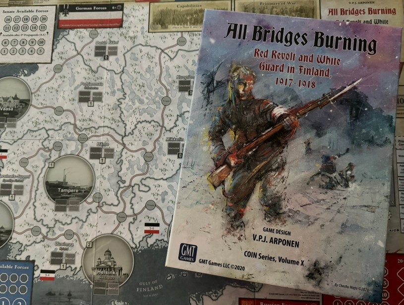
In this entry in the series, we will be taking a look at the beautiful board for All Bridges Burning: Red Revolt and White Guard in Finland, 1917-1918, which is Volume X in the COIN Series from GMT Games. All Bridges Burning is an asymmetric multi-faction game that recreates the political and military affairs of the Finnish Civil War period from 1917-1918. The game is designed as a 3-player affair and includes the Reds who seek to stage a working class revolt and then hold onto their gains, while the White Senate forces seek to reassert control. A third, non-violent Social Democratic faction fights for the survival of moderate leftism and political reform. In addition to the 3 player factions, there are 2 non-player powers including Germany and Russia who offer military assistance to the Senate and the Reds, respectively. The artist for the game is Chechu Nieto whose work we have covered in 2 previous installments in this series including Nevsky: Teutons and Rus in Collision, 1240-1242 and Almoravid: Reconquista and Riposte in Spain, 1085-1086 both which are entries in the Levy & Campaign Series from GMT Games. Chechu is a relative newcomer to the world of wargame board graphics but has worked on some real classics including Fire in the Lake: Insurgency in Vietnam (2014), Colonial Twilight: The French-Algerian War, 1954-62 (2016) as well as the 2 previous games mentioned. I feel that Chechu has a skill to create a very nice overall appearance with his creations and I am very impressed with the quality of his graphics. The board for All Bridges Burning is very unique and is very different from others that he has worked on but one thing holds true. The details included as accents or to highlight various important spaces or areas of the board are truly great.
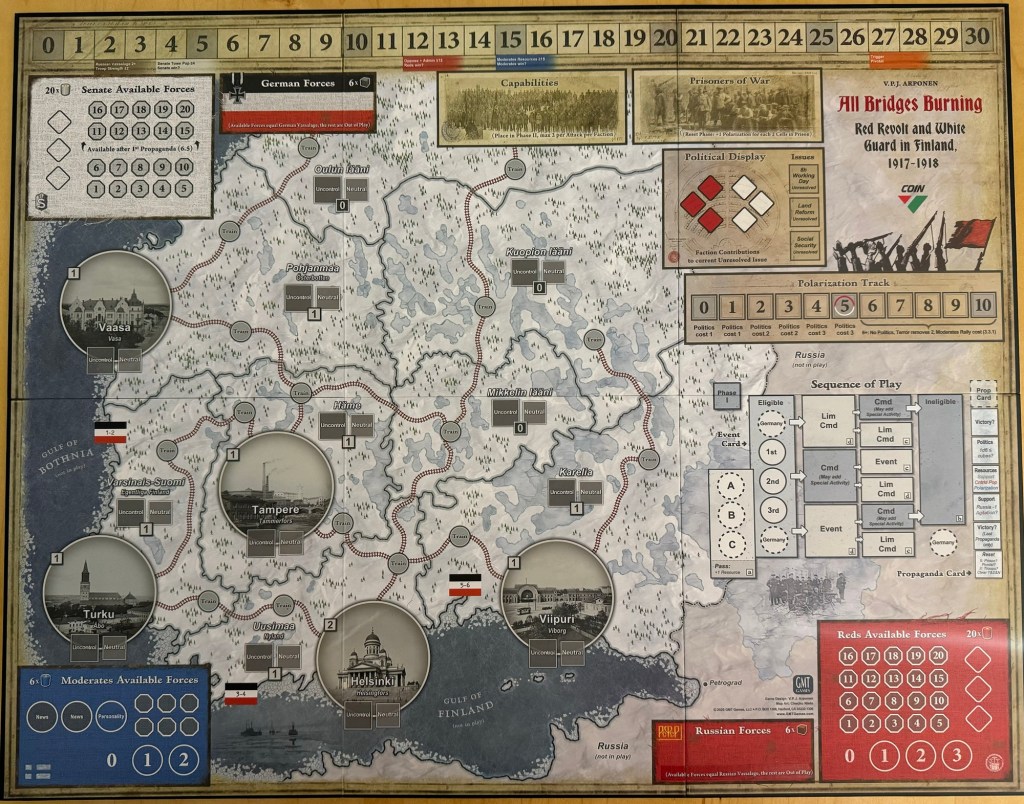
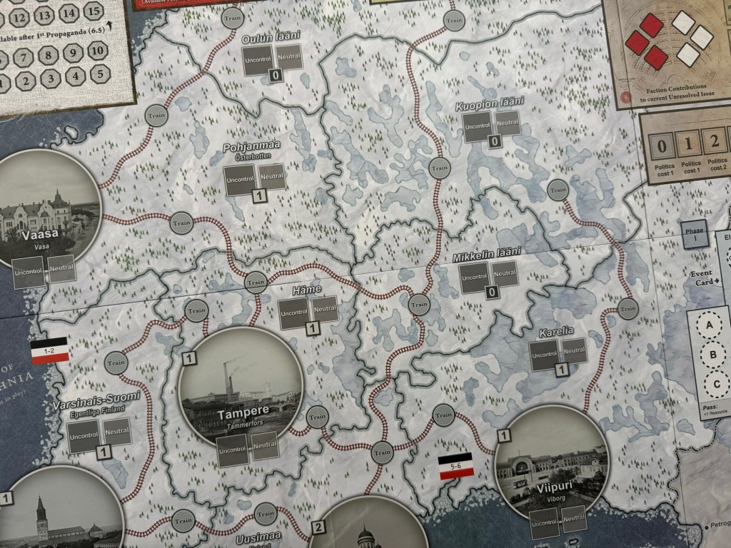
The board is a very irregular size of 20″ x 25 1/2″ and is mounted. While the board is diminutive, and very compact I might add, it really has a great overall look and immediately stands out as a high quality production. From a geographic standpoint, the board is not a full representation of Finland but focuses mainly on the populated areas of the south along the Gulf of Finland including the 5 major Towns of Turku, Tampere, Helsinki, Viipuri and Vaasa. The Towns are represented by larger circles with an actual photograph picture of the major buildings in that area. Each of the Towns also has a number assigned to it which represents the city’s population. The only city to have a 2 population is the capital Helsinki while the other 4 have been assigned a value of 1.
The Towns are pretty non-descript in this game and are black and white photos that appear to have been washed with a gray overtone. I like the stark look of these urban centers as the color choices do stand out when compared with the blue of the ocean and the stark white of the rest of the landscape which is bathed in the glow of a freshly fallen snow as the board is covered in white. I know there is a lot of snow in Finland, as it is sat squarely near the Arctic Circle, but this choice to show its state in the deep of winter is a good one as it matches with what many have as an overall look for the country. Who doesn’t know the picture of the snow covered pines and spruce?
But there is more to the colors in the rural regions called Provinces outside of the Towns than white as when you go in for a closer view you can see the landscape dotted with these green pines and spruce trees. There is not the concentration of the trees that I would have expected but I would think so as to not dominate the landscape, Chechu made this choice to represent the trees more sporadically. You definitely get the feeling of a forest but it is not as dominating as say were the trees on the board for Liberty or Death done by Terry Leeds.
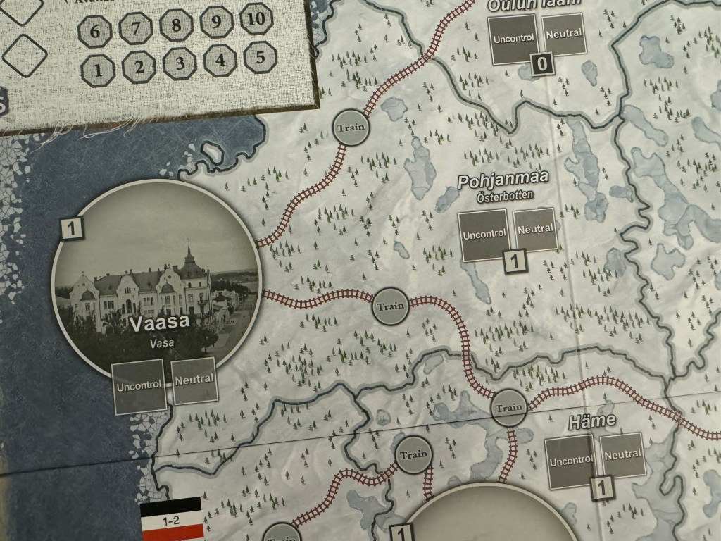
You will also notice the rail lines that crisscross the rural regions and connect the various Towns. Rail travel is a very important aspect of Finland and without the rail lines much of the country would be snowed in during the harsh winter. I really like the choice of red for the rail lines. Not only does the color choice make the rails stand out, to truly highlight their importance to the players, but it gives an impression of strength and passion. Red is a very lively color choice here and also goes well with the names of the different factions being Reds and Whites as when you view the board you can definitely see these 2 colors.
One other element that is really nice about the rural areas is the focus on the many lakes found in Finland. Finland boasts a staggering 188,000 lakes, which is a phenomenal number based on the size of the overall country. Finland is a very water-rich country in terms of water per person and I have seen where the country has more available water per capita as compared to most other countries in central and southern Europe. The lakes are drawn in various shades of grey, white and light blue and they really give the landscape a flowing type of feeling. When you zoom out and look at the board from a high vantage point, the lakes that dot the land really create a mesmerizing flow of color and truly stand out.
After thinking about it, the colors remind me of more modern camouflage for winter fatigues. I really like the choice of colors here, for both the winter feeling it conveys but also for the sense of remoteness and being separated from the whole as each region is very challenging to access except through the rail lines.
I really love the choice of accents for the Gulf of Finland and Gulf of Bothnia as well. As you can see in the picture below, around the edges of the open water as they near the shore of the mainland, you can see that Chechu drew small polygonal shapes that represent the breaking ice as the frozen water gives way to the open sea itself. These polygons are of all different shapes and sizes and really create a fantastic effect against the backdrop of the deeper blue chosen to represent the larger body of water. I actually found myself just getting lost in the line of different shapes as I would try to follow the shoreline as I moved my eye around the Gulf of Finland and Gulf of Bothnia. Also notice the boats and ships drawn into the water as you come nearer to Helsinki. These type of accents have become pretty common to include by Chechu as he did a similar thing in Nevsky and Almoravid but obviously not with ships but with armies, pack animals and other Russian specific elements.

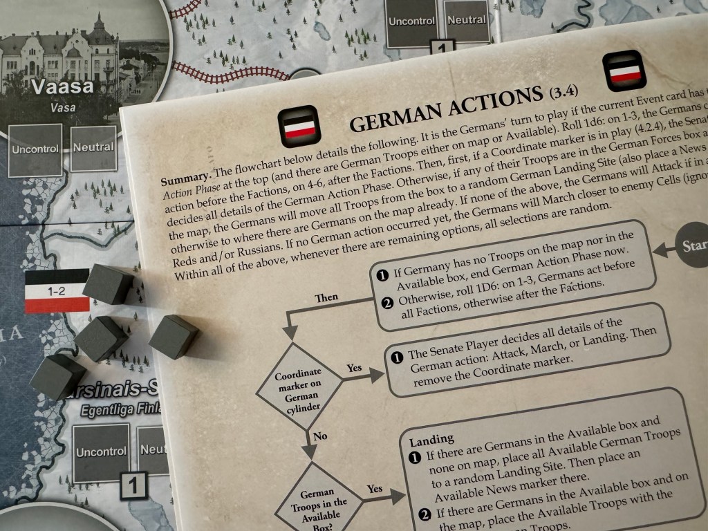
I also want to point out the German flags that are shown on the shore line of the Gulf of Bothnia and the Gulf of Finland with numbers appearing in them. These represent the Landing Spots for the German forces as they begin to intervene in the struggle.

During Phase II of the game, whenever an Event with German Action Phase printed on it becomes the current Event, before any other Factions may conduct their actions, the Senate player rolls 1d6. On a roll of 1 to 3, the Germans take actions first, before the player Factions but if they roll 4-6 they go after the player Factions. The German actions will be determined using the German Actions Flowchart sheet.
I think that my favorite area of the board is the group of Provinces located to the north of the Town of Viipuri. In this area, there is the greatest concentration of frozen over lakes and other smaller bodies of water and their combined aesthetic is quite beautiful! Specifically the area about Karelia is nice as there is a large lake or possibly even a large glacier shown here. You can also see the connection that Finland has with Russia and how the color choice for the background changes from the frozen over white of Finland and her forests to a more grey and muted background. This difference is stark and truly stands out on the board. The border area really has no function in the game but simply adds to the overall feel of the situation and the game itself.

One of the big differences in this edition of the COIN Series was the Eligibility aspect as it relates to the Sequence of Play Box. In All Bridges Burning, the Event Cards do not have Faction symbols printed along the top of the card, as is familiar in other COIN Series games. Rather, Eligibility Order
depends solely upon the actions taken by the Factions. You will notice that the Sequence of Play Box has Commands and Special Activities appearing in different colored boxes, being either white or gray. If a gray box is chosen by the player, this will lead to them being ineligible when the next Event Card is pulled from the deck. I really like how this color scheme works together to form the basis for this eligibility which is such a key part of the game. Playing this aspect well is very important to success and players that simply go hog wild taking all of the full boat Commands and Special Activities the entire game will find that they are missing the more subtle part of the battle for control of how things can and will happen.

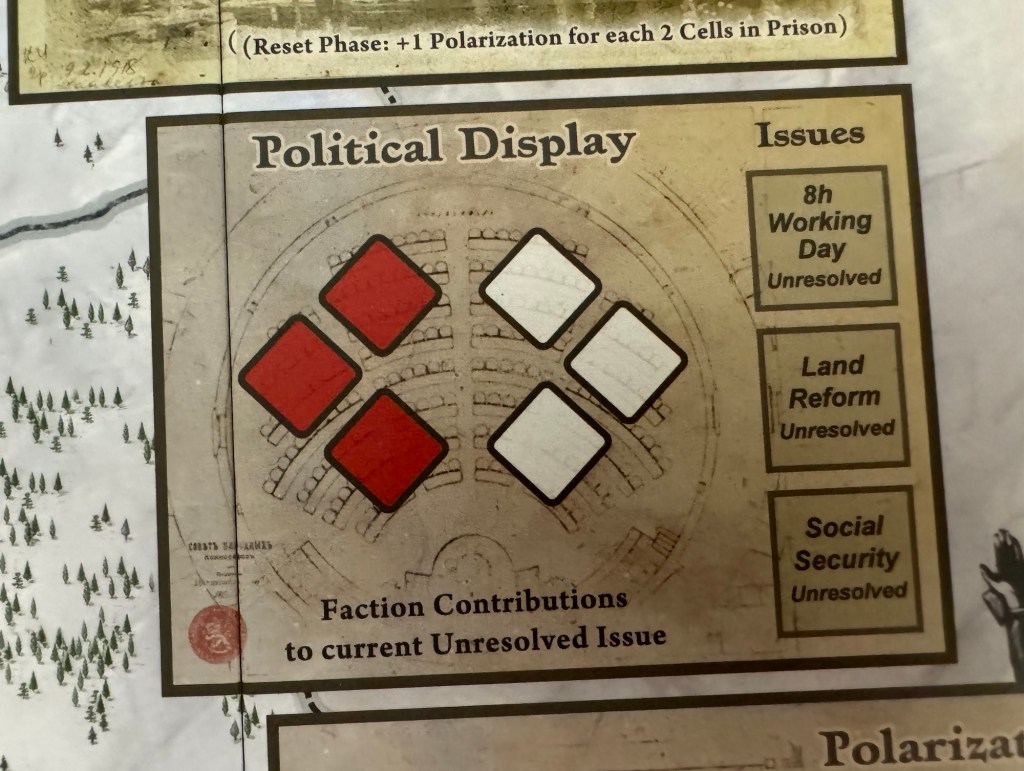
One of the more interesting parts of the game is the Political Display which pits the Reds versus the Whites for control of the nation’s policy initiatives. This Political Display consists of a semicircle that represents the “chamber” with boxes in two of the Faction colors red and white, as well as three boxes, each representing an historical political Issue. Using Politics and Terror, as well as certain Events, the Factions may place or remove cubes in the semicircle. This represents their level of political engagement for a given issue.
I love the faded out look of the “chamber” itself and the illusion that it creates of a semi-circle, even though the red and white spaces, which are simply squares turned on their side, show a different layout and dominate the area as they should. The choice of color is also interesting as it gives the impression of parchment or paper which would be used as a “weapon” in this forum as representatives from each political faction would have fought the battle in its confines not with rifles, swords of armored trains but with pen, ink and the very parchment itself to draft legislation, tally votes and send back channel messages, threats and proposed deals to their allies and enemies in the senate.
The game is also very functional and there are aides to help the players to keep track of their bits that are available in the form of Forces. But take a closer look at this Reds Available Forces Display. You will see the dominant color of red that embodies the box but also can look closer to see a patchwork of fabric that is lightly drawn in the box. I think that this represents the connection that all of the Finnish people would have had in their political leanings. Their friends, family and coworkers standing together to assist and support one another to create the back drop for their individual crusades. But notice along the edges of these boxes, there are fraying pieces of thread that have begun to come apart under the strain of the effort. These threads are outliers at this point and are not a real concern for the integrity and stability of the cloth but as they continue to grow and tear and come apart at the seams, the overall strength and integrity of the fabric will be effected and those that are still firmly centered in the piece will have to do some mending actions to keep the entire cloth together. I love this image and feel that Chechu did a fantastic job in creating this metaphor for the politics of the Civil War.

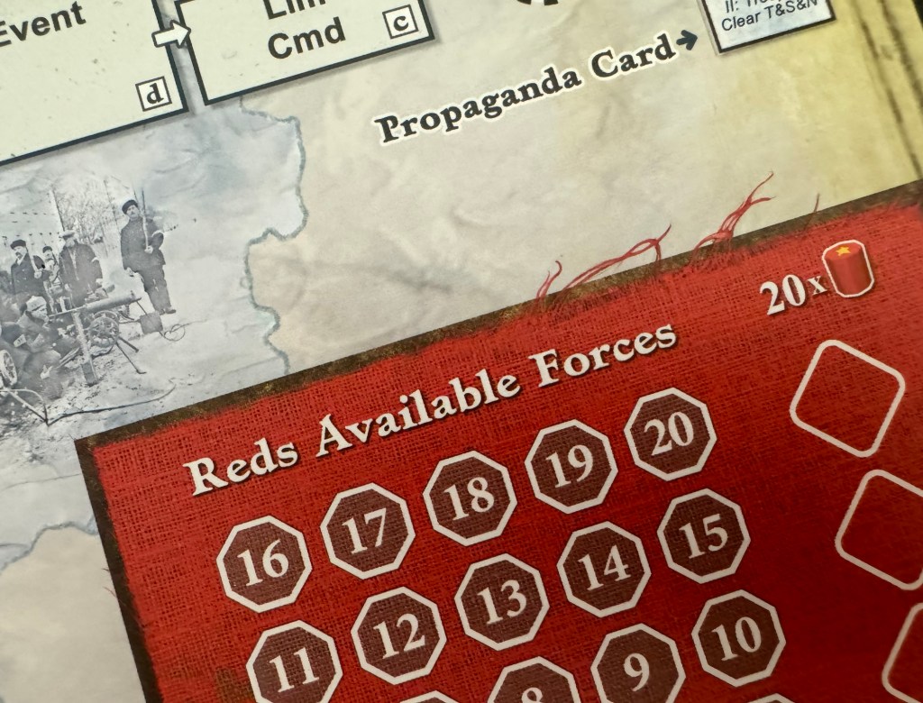
And you would expect this same metaphor to be carried through to the other political alliances and treaties as well as you can see the same effect in the Senate Available Forces Display and the German Forces Display. The same tugging of external and internal forces has caused the whole to begin unraveling around the edges and it will continue toward the same end of a fractured relationship and breaking of alliances.

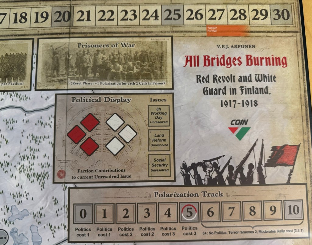
One final aspect of the board that I just love is the Title in the upper right hand corner! This part is done by the venerable artist statesman Rodger MacGowan. The script used and the different color choices for the words are just fantastic. I also really do love the icons at the bottom showing the tattered red flag attached to a bayonet, the clinched and raised fists in the air and the rifles shown. All of these images paint a perfect one shot picture of the situation. That of anger, difference, disagreement and ultimately conflict both internal and external! Just a beautiful image to represent the game itself to those who adventure into playing this fantastic game.
All Bridges Burning was really good as we thoroughly enjoyed the distinct two separate aspects or epochs of the game. These include pre-war intervention by foreign powers and the players attempt to build up their infrastructure and then the commencement of fighting as both Germany and Russia enter the game to provide troops and change the available actions for the players. As a 3-player COIN, the game creates a lot of great interactions between the three factions as each are very different and somewhat different from other COIN Series games and their factions. We also really liked the new card based bots as they create a totally new experience from the other flow chart based bots used in past volumes of the series. The cards create a bit more randomness as the bots actions will change based on the cards and this creates a feeling of unease as the players simply cannot look at the flowcharts to attempt to anticipate what the bots will do and how they can be foiled. I really like the 3-player interaction as well and overall have been very impressed with the design. It feels like a wargame, moreso than some of the other COIN Series entries, with more direct combat with German and Russian Forces represented by cubes, Armored Trains and Artillery pieces, but also has that same quirkiness with a faction in the Moderates that can win by just doing their thing and being left alone.

Here is a look at our unboxing video so you can get a good look at the components:
Here is a look at our video review of the game:
We were able to do an interview with designer VPJ Arponen and also have done a series of Event Card Spoilers that will give you a good feel for the game and it’s history: #3 November Revolution in Russia, #8 General Strike, #9 Declaration of Finnish Independence, #27 The Reds Launch a Major Offensive, #43 Rough Justice, #45 Finland’s Fate Hangs in Balance, #24 Red Revolt!, #25 Disarming Russian Garrisons,#11 Weapons from Russia? and #30 Meetings in the Catacomb.
The next board that we will take a look at in the series is Storm Over Jerusalem: The Roman Siege from Multi-Man Publishing designed by Scott Blanton and illustrated by Charles Kibler.
Here are links to the previous entries in the series:
Kekionga!: A Dark and Bloody Battleground, 1790 from High Flying Dice Games
Campaigns of 1777 in Strategy & Tactics Magazine #316 from Decision Games
Battle Hymn Volume 1: Gettysburg and Pea Ridge from Compass Games
From Salerno to Rome: World War II – The Italian Campaign, 1943-1944 from Dissimula Edizioni
This War Without an Enemy: The English Civil War 1642-1646 from Nuts! Publishing
Holland ‘44: Operation Market-Garden, September 1944 from GMT Games
Maori Wars: The New Zealand Land Wars, 1845-1872 from Legion Wargames
Imperial Struggle: The Global Rivalry – Britain & France 1697-1789 from GMT Games
Stilicho: Last of the Romans from Hollandspiele
Nevsky: Teutons and Rus in Collision, 1240-1242 from GMT Games
A Most Fearful Sacrifice: The Three Days of Gettysburg from Flying Pig Games
Donnerschlag: Escape from Stalingrad from VUCA Simulations
Keep Up the Fire!: The Boxer Rebellion Deluxe Edition from Worthington Publishing
Liberty or Death: The American Insurrection from GMT Games
Lanzerath Ridge: Battle of the Bulge from Dan Verssen Games
Salerno ’43: The Allied Invasion of Italy, September 1943 from GMT Games
Bayonets & Tomahawks: The French and Indian War from GMT Games
Undaunted: Normandy from Osprey Games
Traces of War from VUCA Simulations
SCS Ardennes II from Multi-Man Publishing
Almoravid: Reconquista and Riposte in Spain, 1085-1086 from GMT Games
Walking a Bloody Path: The Battle of Fallen Timbers, August 20, 1794 from High Flying Dice Games
-Grant

Great game and an equally good article! Thanks for sharing your thoughts on a gem of a game!
Ric
LikeLiked by 1 person
It is really good and just happens to LOOK good as well! Thanks
LikeLike
I absolutely love Chechu’s work on this game. I recall seeing the first card art samples from Chechu (where the “ripping cloth” effect is used as well) and being in awe. The map he created later turned out to be just as amazing.
The game logo is by Rodger B MacGowan, by the way.
I know this article is about the map, but a special mention of the box cover that Chechu created is in order!
As to the winter look of the map – in the beginning there was this playtest map: https://boardgamegeek.com/image/4089261/all-bridges-burning-red-revolt-and-white-guard-in
The original idea was simply to save printer ink and create a black and white playtest map. Soon I realised the winter look was getting positive reactions from playtesters. It stands in a neat contrast to the lush jungles and distant dusty plains of some of the other games in the series.
The idea of including individual trees on the map was originally definitely a nod to the Falling Sky map. Chechu came up with the breaking off ice sheets effect for the water areas.
The image embedded in the water of ships is actually a historical photo of a German contingent arriving in Finland about to make a landing. In the image you can see ice sheets floating in the water. The waters around Finland regularly freeze over in the winter.
LikeLiked by 1 person
Thanks for sharing Vez. I like the logo as well and will edit it to give a nod to Rodger. Nice work! It’s a great little COIN game.
LikeLike