
Continuing along in this new series devoted to the best looking boards found in the wargaming world where every other Friday, I will highlight the art and layout of a different board in a wargame that we have played to show you the various talents of the artists and graphic designers involved. In my humble opinion, a well designed and attractive board can make all the difference in the world to me enjoying a wargame. Don’t get me wrong, the game has to be good, but if it’s also good looking it always is a better experience. A board can draw me in. Can make me feel that I’m there. Can set the stage for the thematic immersion that we all crave. And I have found many of these type of boards and I want to make sure that I share them with you.
Nevsky: Teutons and Rus in Collision, 1240-1242 is a wargame about the age old struggle between Latin Teutonic and Orthodox Russian powers along the Baltic frontier of the mid-thirteenth century. The game is the first entry in a new series called the Levy & Campaign Series which focuses on pre-industrial age conflicts and, as you can see from the name of the series, requires players to focus on some of the logistics aspects of warfare including providing for the payment and feeding of your vassals and their troops as well as planning out the length of service of your hirelings. This game was a very new experience for me as we had to think differently about how to go about prosecuting a war in a foreign land where you are far from your supply sources and have only a limited time to accomplish your goals before your time is up. Well, now that I think about it, that statement isn’t actually true as I have played lots of East Front WWII games where the Germans are invading Russia. This game is kind of that situation just 700 years earlier before there were tanks. But rather than tanks, carts and sleds are your mobile units.
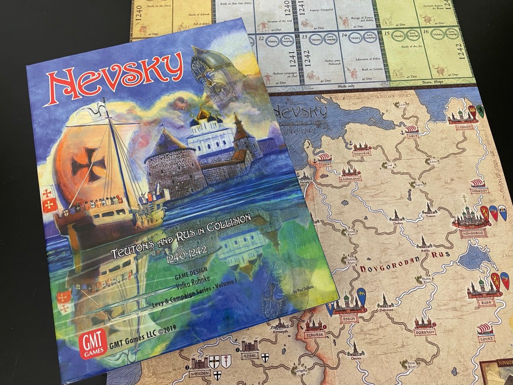
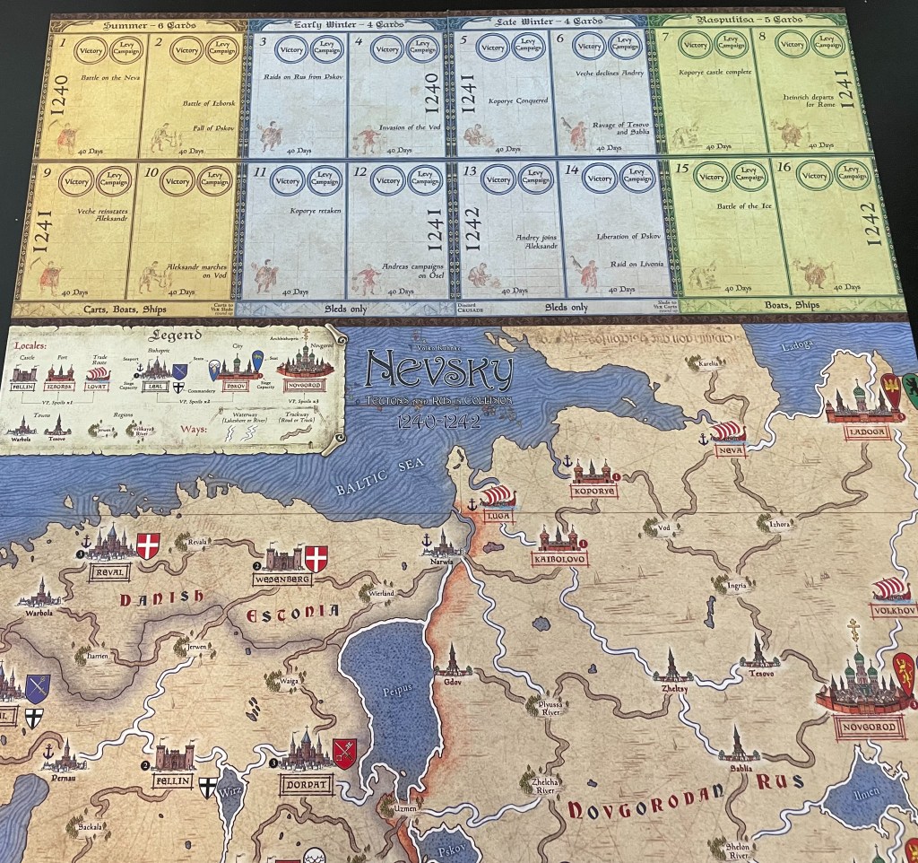
Nevsky was a source of a bit of disagreement when it was released due to its garish cover art. I loved the art and was glad to see it taking a new direction aside from recycling historical paintings or images but going out, taking a risk and getting original art made for the game. The board however was widely praised for its aesthetic and use of period accents to create a wholly immersive work that catapulted (pun definitely intended) players into the 13th Century. The board artist is Chechu Nieto who is a relative newcomer to the world of wargame board graphics but has worked on some real classics such as Fire in the Lake: Insurgency in Vietnam (2014), Colonial Twilight: The French-Algerian War, 1954-62 (2016) and All Bridges Burning: Red Revolt and White Guard in Finland, 1917-1918 (2020), all three entries in the beloved COIN Series from GMT Games. Chechu has a very nice look to his creations and I am very impressed with the quality of his graphics on Nevsky. The map is somewhat devoid of great detail, at least detail that is readily apparent, but does cover the basics of the region and clearly highlights the challenges of the terrain in the use of very subtle lines and images with shading. The roads and rivers are really clearly called out, as you would expect as this game is based on logistics and the struggle of campaigning in the frozen tundra of Russia. The most prominent section of the board though is the Calendar. Let’s take a look at this large feature and discuss how it works as well as the tiny graphical elements that make it pop.
The board is a small mounted mapboard which measures 17″x22″ and fully 25% of the board is taken up by the Calendar, which runs the full width of the top of the board. The Calendar tracks both time and victory. During any one of the scenarios one or more Seasons, including Summer, Early Winter, Late Winter and Rasputitsa will be tracked on the Calendar. You probably don’t recognize Rasputitsa but it is a Russian term for two periods of the year when travel on roads or across country becomes difficult due to extremely muddy conditions from rain or thawing snow. Each of these seasons has two spaces on the Calendar.
On the Calendar players will place the Lords that they can Hire into service for a period of time which is 40 days. Players place the Lords that they can into the seasons for which they are available to hire and they can then be moved on the Calendar based on Event cards that are played by either you or your opponent.
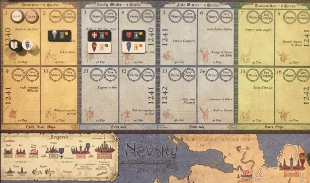
The very interesting part about the design is that you will have to worry about when the service periods will end for your Lords and Vassals. Unlike other wargames, your soldiers are not necessarily around and available for the entire game. They have a choice to leave and it is up to you to change their mind. This Calendar system places the onus on you as a player to plan and then to get going with that plan. You will have to know when your time is up and then plan for how to pay those whose time is expiring to get them to stay with you a bit longer. This payoff will be in the form of Coin or Loot and is a major focus of the Levy Phase.
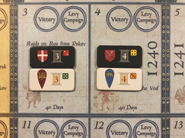
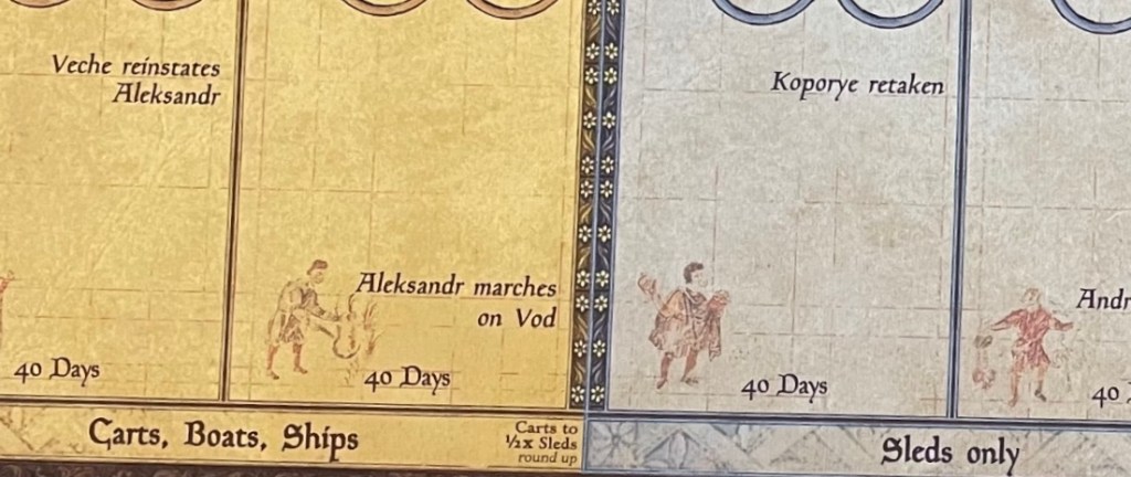
There are a couple of very interesting design elements used on the Calendar portion of the board that mimic the styles found in art from the 13th century. First is the various personages shown in each turn segment of the calendar. They are a bit muted and washed out, as if they are trying to reproduce the worn and faded look of many such paintings from the period. They also are in different poses and somewhat portray the historical events that are listed in the spaces. In the below picture, these are “Raids on Rus from Pskov” and “Invasion of the Vod”. I found it very interesting to examine each of the pictures and enjoyed looking at them and marveling at their detail and the extra effort given to them to make them appear older than they are. You will also notice the coloration used for the different turns reflect the time of the year and season that is represented. The Summer Turns, including Turns 1-2 and 9-10 are yellow emulating the heat and dryness of the season. The Winter Turns, including Turns 3-6 and 1-14, are light blue and definitely give the feeling of frozen terrain and blustery cold that typifies the winter. Finally, the Rasputitsa or Spring Turns, are green and lush due to the warming temperatures and plentiful precipitation (Rasputitsa is a term that literally means a muddy season that hinders travel.). Maybe the Spring Turns should have been brown as the melting ice and snow and plentiful precipitation turns the green landscape to mud and muck, which is hard to pass and slows transit.
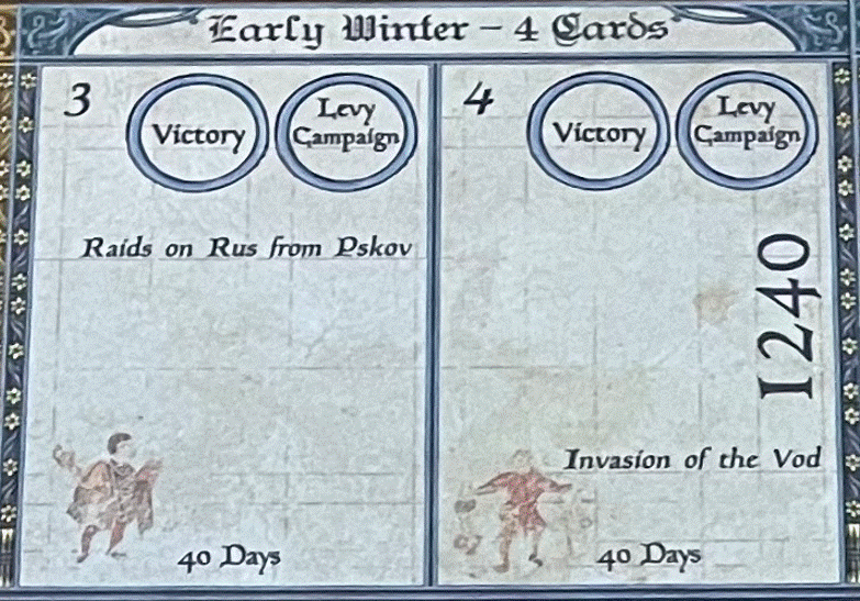
Also highlighting the Calendar is a very interesting choice of accent in the form of small white flowers that appear to be similar to the Chamomile, which is the national flower of Russia. This aromatic plant has daisy-like white flowers and medicinally has calming effects. A very nice choice of accent for this very important part of the board. These flowers line the outside of each season and remind the player that a change is upcoming. At the very bottom of the Calendar is found the transportation assets that are useable during each of the seasons. Carts, Boats and Ships can be used during the Summer, as the ground is firm and allows for wheeled assets to traverse the roads, while in Winter only Sleds will be usable to transport goods in the form of Gold and Provender to supply the troops on campaign. But Sleds can’t cross bodies of water?….well, yes….unless those bodies of water, including rivers and lakes, are frozen. Then they can be crossed by a Sled. During Rasputitsa, Carts and Sleds will not work as only Boats and Ships can be used to move across the steppes of Russia as the ground is completely over saturated and turns into a quagmire. These highlights on the board make it clear that this is a game about supply and transportation as much as it is a game about sieges and pitched battles.
One final comment about the Calendar. Those are not coffee stains on my board. Or spots left by diet Coke. Those are water spots/stains that have been deftly put in by the artist and I think this touch is my favorite design choice as it wreaks of antiquity and the passage of time. It really adds some depth to the overall appearance of this section of the board and I am glad that Chechu went this route.
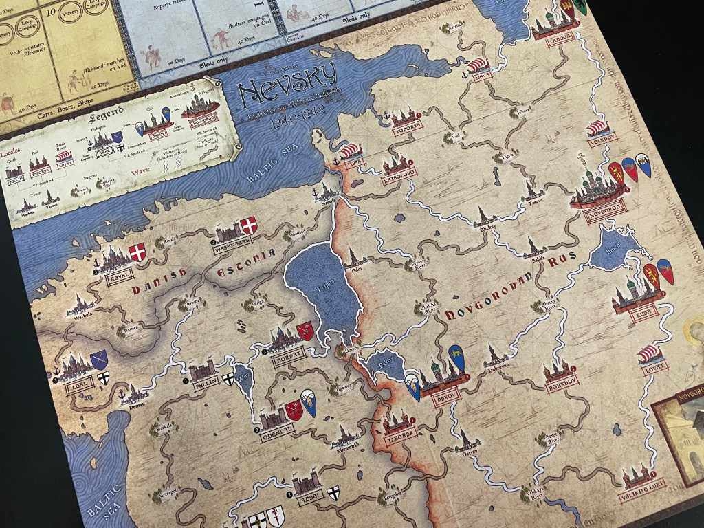
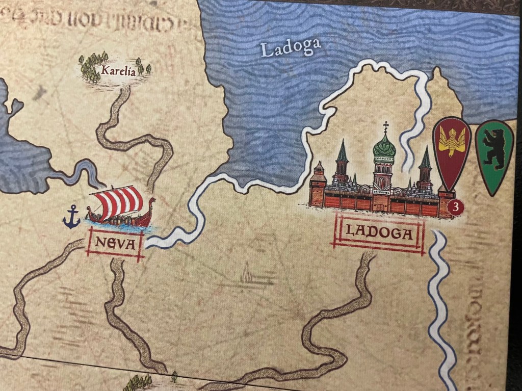
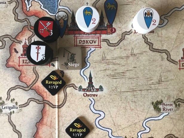
In looking at the overall playing surface of the board, it covers both Teutonic Territory, including portions of Danish Estonia and Crusader Livonia as well as the Novgorod Rus. If you look closely, you will see that Teutonic lands are shaded over with a gray wash while the Rus lands have a red tint. This becomes very evident at the border of these two territories. The board depicts the Baltic frontier and shows various Locales (Regional, Cities, Towns., Trade Routes, Forts, Castles, Bishoprics, etc.) across the board and is then crisscrossed by Ways, which consist of both Waterways and Trackways that link up these Locales. The Waterways are colored light blue but to the eye appear white while the Trackways are colored brown (once again probably due to the muddy mire of the Rasputitsa). I really like this board. It simply works well and gives you a feel for the terrain and the situation. It is very thematic with its accent choices, as well as its deft use of limited color to make important areas stand out.

If you look at the above picture, you can see the way that different Locales are treated differently graphically. For example, framed Locale names indicate places which are considered important enough at the time, either due to their size, status or strategic location, to provide the conquering player “Conquered” victory point markers when the enemy succeeds in taking them. The different type of border color indicates their VP value. For instance, a place with just a single border on the framed name, will provide one VP marker, while two markers show that a City or Bishopric provides 2 VP and three borders for Novgorod equates to 3 VP. This is a really nice touch to go along with the relative size differences in these Locales as well. I really enjoy a game that makes VP areas really clear on the board and Nevsky does this very well. It also doubles as a nice aesthetic touch to the board providing some additonal interest and catching the eye. You will also notice in the above picture, that the 2 VP Pskov is nearly twice the size of the 1 VP Izborsk and further reinforces the differences in these Locales.
Novgorod is the largest of the Rus Locales and is definitely grander that all the other locations on the board. You will notice the three borders found in the framed Locale name and also notice the walls, towers and other formidable defenses of this major city. The other really great part of the Novgorod Locale is the presence of the Onion Domes. An Onion Dome is simply a type of architectural dome usually associated with Russian Orthodox churches. Such a dome is larger in diameter than the drum it is set upon and its height usually exceeds its width. These are distinguishing features of most major Rus cities and most of us have the image of the Kremlin in our mind when we see these. The addition of this to the board is simply fantastic and really adds once again to the thematic immersion and the player engagement with the game.

I do want to show you one other really interesting Locale that is very unique. The Trade Route, as mentioned above, is a center for trade in the area and is identified on the board with the inclusion of a ship. These are typically located on waterways near the major seas in the area. In the picture below, you can see two Trade Routes in Neva and Luga. These are both connected to the Baltic Sea via a waterway.
While we are looking at these Trade Routes, I want to also mention the great detail given to the Baltic Sea. The rich tapestry of blue wavy lines create a nice feeling of motion equating the motion of the waves and really help this portion of the board to stand out. It also is a nice touch to frame the game title here against the background of the sea as the blue sets off the white outlined black lettering.
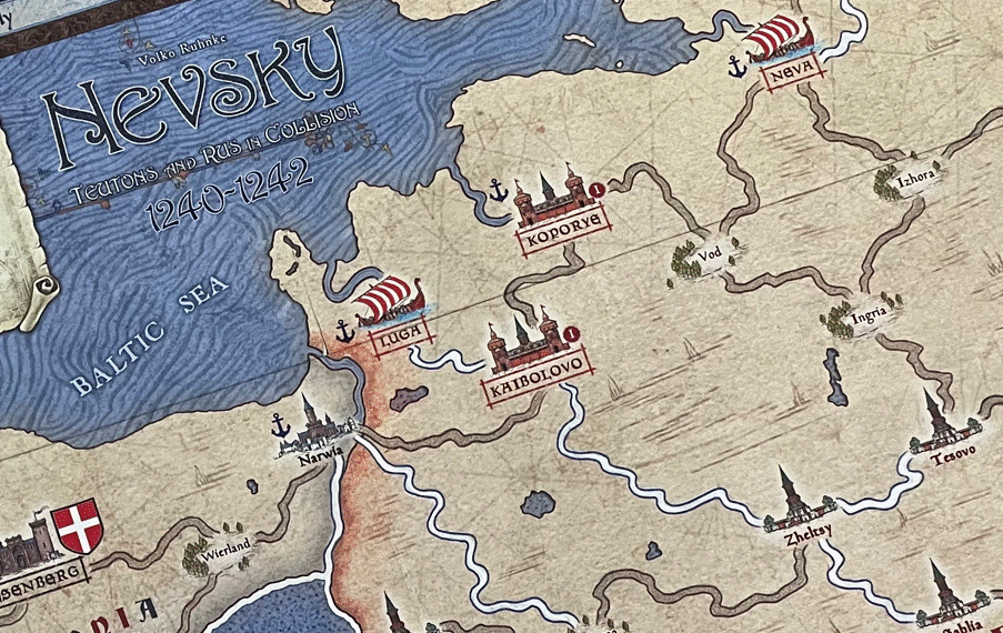
A few final accents that I wish to point include the treatment of the terrain as well as the presence of other lines throughout the board. If you look closely at the below picture, you will see the presence of horizontal black lines across the landscape as well as the ghostly outline of some shrubbery and scrub brush. This is a nice touch to the board as frankly it is not needed because terrain doesn’t play into the game in either movement or combat. But, I think it was important for Chechu to show the prevalence of swamps in the Rus frontier with these accent points. We all know that Russia has a reputation for some very imposing and impenetrable terrain in the form of marsh and swamps. Every East Front wargame that I have ever played shows the presence of these nearly impassable areas that always drive the Blitzkrieg around them on their way to Moscow and Leningrad rather than through the low lying areas. Karelia has multiple swamps in the area and they are shown very well here. In fact, every picture that I have seen on the internet has the swamp shown with trees, brush and shrubs that are no taller than a few feet as the ground simply doesn’t support the growth of large trees in the areas. Another example of a very nice touch that adds depths.
I also want to point out the various thin black lines that seem to cross the terrain at various angles. They almost appear to have been drawn with a ruler and compass as they radiate out from a central point and cover an area (such as the above shown land between Neva and Ladoga). I have thought about what these lines could represent and I have come up with the idea of footpaths, or even game trails, that go through these swampy areas. They are not Trackways, as the land doesn’t allow that, but they could be game trails or simple foot paths that the local population uses to gain access to the rich wildlife and plants in the area. They are definitely not normal roads and further highlight the importance of the limited Trackways through the Rus frontier.
The package for Nevsky is simply stunning and the artist captured the elements of this style of medieval warfare that typifies the Levy & Campaign Series perfectly! Nevsky is not only a good looking game but is a great game to play. One of the things that I like about the design is that it requires the players to think about what they are doing and how they can accomplish those tasks. With its focus on logistics and the levying of Lords and troops to fight, the game creates a totally new experience for players. But, with this paradigm shift, the game is not difficult to learn, as all of the stages and processes have the steps involved clearly laid out to make following them very easy. The game has some very interesting aspects such as the diceless combat for Attacks but rolls for Defense. The units are also very interesting and provide the player with a lot of choices about how to best use their available forces. You can risk your best units the Knights in trying to absorb Hits but you need to understand they do 2 Hits in Battle and if lost you might not be able to mount enough Hits to end the Battle in your favor. You can also hold onto Event cards to use when you are outnumbered to give you the advantage in Battles.
I actually included Nevsky on my Top 10 Wargames of 2019! checking in at #5. I feel if we had a few more plays to get more comfortable with the system you would have seen this game a bit higher on the list. But it is an amazing production and the planning aspect is so key, along with supply, that it will change your mind about logistics.
Here is a look at our unboxing video for Nevsky: Teutons and Rus in Collision, 1240-1242:
We also did a video review and you can watch that at the following link:
The next board that we will take a look at in the series is A Most Fearful Sacrifice: The Three Days of Gettysburg from Flying Pig Games designed by Hermann Luttmann and illustrated by the late Rick Barber.
Here are links to the previous entries in the series:
Kekionga!: A Dark and Bloody Battleground, 1790 from High Flying Dice Games
Campaigns of 1777 in Strategy & Tactics Magazine #316 from Decision Games
Battle Hymn Volume 1: Gettysburg and Pea Ridge from Compass Games
From Salerno to Rome: World War II – The Italian Campaign, 1943-1944 from Dissimula Edizioni
This War Without an Enemy: The English Civil War 1642-1646 from Nuts! Publishing
Holland ‘44: Operation Market-Garden, September 1944 from GMT Games
Maori Wars: The New Zealand Land Wars, 1845-1872 from Legion Wargames
Imperial Struggle: The Global Rivalry – Britain & France 1697-1789 from GMT Games
Stilicho: Last of the Romans from Hollandspiele
-Grant

What a great post on a great map!
LikeLiked by 1 person
What a close eye!! And I did not know that chamomile is Russia’s national flower!
LikeLiked by 1 person
I didn’t either but as I was just doing some research for the post saw that and was sure that Chechu included it intentionally. Maybe he didn’t but it was a very happy accident! Great looking board. Makes the experience better.
LikeLike
A truly beautiful map. Those faint lines on the map are meant to recall the look of a rhumbline network, common on medieval maps.
https://en.wikipedia.org/wiki/Rhumbline_network
LikeLiked by 1 person
Nevsky is quite engaging. If you have not given it a spin over on https://rally-the-troops.com/ I highly recommend it. I’m looking forward to giving Inferno a try as well.
LikeLiked by 1 person