
Continuing along in this new series devoted to the best looking boards found in the wargaming world where every other Friday, I will highlight the art and layout of a different board in a wargame that we have played to show you the various talents of the artists and graphic designers involved. In my humble opinion, a well designed and attractive board can make all the difference in the world to me enjoying a wargame. Don’t get me wrong, the game has to be good, but if it’s also good looking it always is a better experience. A board can draw me in. Can make me feel that I’m there. Can set the stage for the thematic immersion that we all crave. And I have found many of these type of boards and I want to make sure that I share them with you.
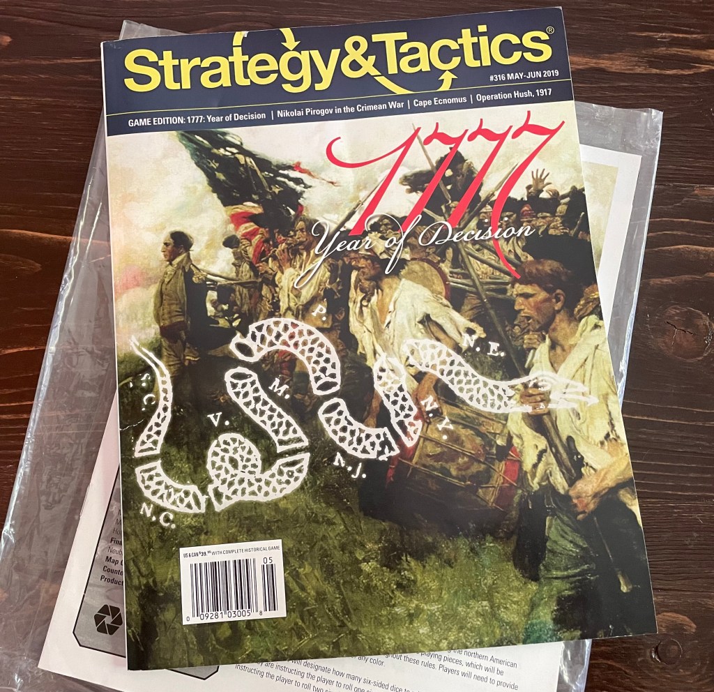
Campaigns of 1777 is a 2-player, point to point movement magazine wargame in which players control the Patriots or the British in the northern Colonies during 1777, which was a critical year in the American War for Independence. As you know, the Patriots scored their first major victory at Saratoga that year and this was enough to bring in the French on their side.
First off, I want to point out this game is a magazine wargame. This usually means that the production value of the game with the map, counters and player aids (if they even provide them) is on the lower end of the scale due to many factors including price and limited space. Usually, magazine wargames are designed as functional with their components and truly lack on the artistic and aesthetic side of the scale. Don’t misunderstand me though as this isn’t a bad thing as I have played many great magazine wargames and they definitely have space in the hobby and provide an interesting medium for designers to experiment and explore different topics. But in the case of Campaigns of 1777, the game is definitely unique in this genre and provides not only a well designed and interesting play experience but also really goes all in with the art and the board is simply on another level. Terry Leeds talents have shown through on this project. He has designed some really great boards for other games that we have loved including Paths of Glory, Fields of Despair and Liberty or Death from GMT Games and Saratoga 1777 AD from Turning Point Simulations to name just a few. He has a very good talent for clearly representing the terrain and topography of the battlefield and always throws in interesting choices for accents.
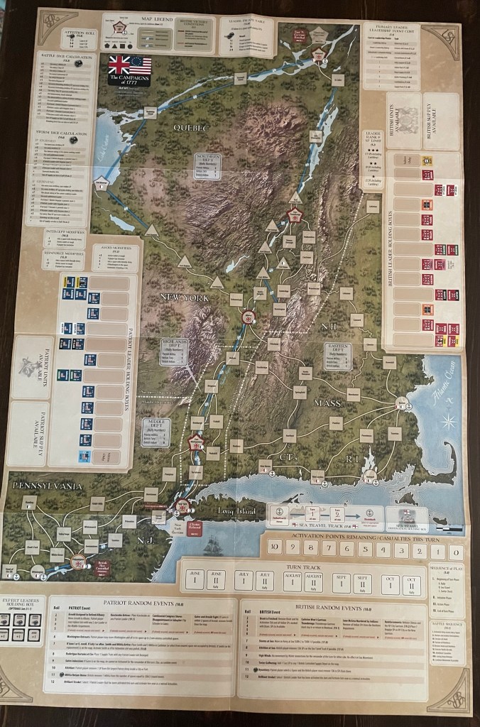
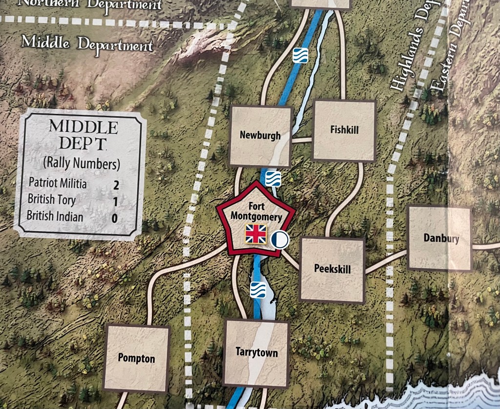
The board for Campaigns of 1777 covers a large area of the Middle and New England Colonies including Pennsylvania, New Jersey, New York, Connecticut, Rhode Island, New Hampshire and Massachusetts, as well as parts of lower Canada in Quebec. The map further breaks these colonies into areas and calls them the Middle Department, Highlands Department, Eastern Department and Northern Department. These areas are clearly separated by dashed white lines and are important during the Rally portion of the Sequence of Play as the number of units per side, including Patriot Militia, British Tories and British Indians, are limited based on tables shown in the Department Boxes. These different areas have different Rally numbers either because of population density or due to being a Patriot or Loyalist stronghold.
The element that truly makes this board stand out from the crowd is the inclusion of very realistic and almost photographic quality terrain. Terry has a real talent for this part of the illustration of wargame boards and you can see his talents in several of the games mentioned in the introduction. In the picture below, which shows the areas surrounding Albany, you can see the Taconic Mountains to the left and right of the city.
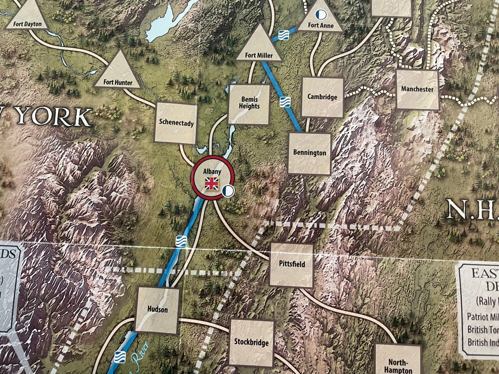
And to the southwest of Albany are the majestic Catskill Mountains shown in all their glory. As I looked closer at the board, and really got into the details shown on the terrain, I was most captivated by the depiction of the mountains. You can see the peaks and the valleys as the mountain slabs of granite show their erosion over millennia. These mountains are present and create a very sense of boundary for the more civilized parts of the map and the points of connection from these areas follows the path of these mountains from Albany to Pittsfield, from Fort Hunter to Schenectady. The mountains are not moving and you can feel that.
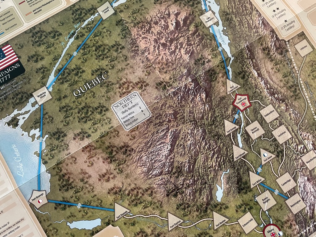
I really was impressed with the cluster of mountains to the west of Fort Ticonderoga as these are a major part of the board in the Northern Department. I had to look several times, very closely, to make sure that the depiction wasn’t just a picture. The detail and contours shown here are just awesome! This mass of granite is really foreboding and you can see the reason for the construction of Fort Ticonderoga here as both the fort and the mountains block access to upper New York. The jagged peaks to the east are also very impressive and almost resemble a spine as they thinly make their way south Manchester. Very impressive work here with the attention to detail and the focus on the permanence of the geography.
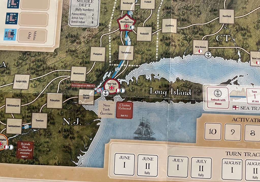
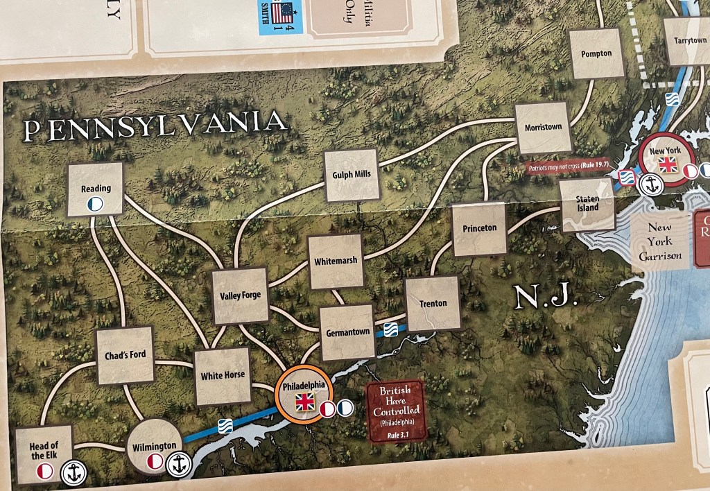
As we move to the bottom of the map, the terrain changes but also comes into contact with the Atlantic Ocean as in the Middle Department we are introduced to Long Island and the coast. I really liked what Terry did here with the wavy lines emanating out from the shore and the use of color to differentiate deeper water from the shallows. He even included a few ships of the line on the board sailing in the water which was a nice touch. I almost half expected there to be the iconic words “Here be Dragons!” scrawled in the water but alas it doesn’t appear. The terrain change is also very clear in the Middle Department as the mountains give way to thick green forests that are common here and dominate the landscape. I do also really like though how he still incorporated the elevation to the north and west of New York City where you can see hills and the leavings of rock from the recession of the glaciers. You can even see the gouges in the stone.

Another interesting area on the board is the Cape Cod Bay south of Boston and the Atlantic Ocean. This point of the map really is interesting and draws your attention for sure. You can even see the very top of Martha’s Vineyard in this picture. I really like the way that Terry used the lines in the water showing motion and life. It really makes the water stand out almost as prominently as the mountains.
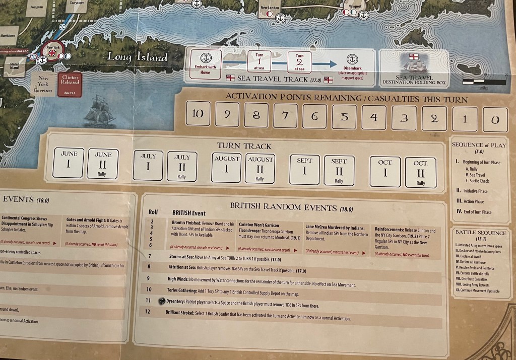
The only part that I wish was different was the location of and way that the various tracks and boxes are shown. They are very functional and are placed at the bottom of the board so that both players have access to easily view them from their seats on the side of the boards. But, they just stand out a bit too much and take up lots of valuable real estate on the board. I wish that somehow they were better incorporated into the map itself.
The map uses point to point movement and I like the use of non-straight lines to connect the various points. Typically in point to point movement boards, you will see that only straight lines are used, as if drawn with a compass simply connecting the different boxes. Here the wavy lines imitate the way the road system in Colonial times would have ebbed and flowed with the land. These country roads were not always straight shots as there were hills, dense forests, rivers, streams, ditches and swamps to avoid and go around. To me, the use of the wavy lines here are perfect and give me that feeling of being in a rural area, as most of these areas on the map were at the time.
We really enjoyed the game and the beauty of the board aided in the experience for sure. We found it to be a very interesting look at the battles fought in the northern Colonies including the Sieges of Fort Ticonderoga and Fort Stanwix, the battles of Brandywine, Germantown and Saratoga as well as the surrender of Burgoyne’s army at Saratoga. The game uses point to point movement so there are only a few ways that the British can come down from Canada to attack the Patriots and the Patriot player knows this and must maneuver their forces well to intercept and slow their advance down before they are beaten by the overwhelming British forces. The terrain here is a major character in this drama and Terry Leeds did a fantastic job in giving that terrain some real life with his depictions and choices with the board. I really liked playing as the Patriots as I had to pick my battles well and try to slow their advance rather than chasing them off the field in an overwhelming victory.
I also liked that there are several key forts on the British route down the Colonies and the Patriot can put up a pretty staunch defense by planning out moves and thinking about how to force the sieges to take one more turn than the British player expected. Of course, the British can use sea movement to quickly marshal their forces to appear in key locations to put more pressure on the Patriot player and force them to take actions they don’t want to take. Overall, a great game of cat and mouse that felt very thematic and was true to history.
Here is a look at our unbagging video for Campaigns of 1777 illustrated by Terry Leeds:
We also shot a video review and you can check that out at the following link:
Finally, if you are interested in Campaigns of 1777, you can pre-order a Deluxe Edition copy (as the original magazine is sold out) for $51.95 from the Decision Games website at the following link: https://shop.decisiongames.com/ProductDetails.asp?ProductCode=P%2D1031
The Deluxe Edition will have a mounted map board so the map will be that much better!
The next board that we will take a look at in the series is from Battle Hymn Volume 1: Gettysburg and Pea Ridge from Compass Games designed by Eric Lee Smith and illustrated by Robert Shields.
Here are links to the previous entries in the series:
Kekionga!: A Dark and Bloody Battleground, 1790 from High Flying Dice Games
-Grant

Very impressive, especially for a magazine game.
Another game you might want to see is the Second Edition of Nemo’s War (VPG). The story behind it is that a renown graphic artist (generalist, not only boardgames) in Australia absolutely adored the First Edition of the game. He contacted VPG, and volunteered to do the artwork for the Second Edition for much less than his usual fee. It’s the Kickstarter version, and it’s quite stunning.
LikeLiked by 1 person
Hello. You really need to ask my permission to use my work. Also you need to mention and link to The Players’ Aid.
LikeLike