
Continuing along in this new series devoted to the best looking boards found in the wargaming world where I will highlight the art and layout of a different board in a wargame that we have played to show you the various talents of the artists and graphic designers involved. In my humble opinion, a well designed and attractive board can make all the difference in the world to me enjoying a wargame. Don’t get me wrong, the game has to be good, but if it’s also good looking it always is a better experience. A board can draw me in. Can make me feel that I’m there. Can set the stage for the thematic immersion that we all crave. And I have found many of these type of boards and I want to make sure that I share them with you.
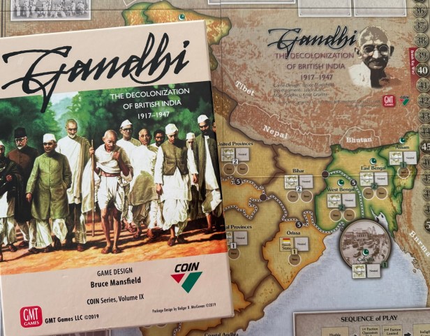
In this entry in the series, we will be taking a look at the beautiful board for Gandhi: The Decolonization of British India, 1917-1947, which is Volume IX in the COIN Series from GMT Games. Gandhi: The Decolonization of British India explores one of the world’s most prominent experiments with nonviolent resistance, and takes us to the subcontinent of India, the jewel in the crown of the British Empire, for a detailed look at the final decades of the British Raj. The game offers a new perspective on the history of insurgency with the addition of a new type of faction to the COIN Series, the Nonviolent (NV) faction, while retaining the multi-faction, asymmetrical, card-assisted system of earlier titles in the COIN Series. The factions include the British Raj, the Indian National Congress, the Muslim League, and the Revolutionaries. The artist for the game is Knut Grünitz. He has done some amazing work on several other games including Enemy Action: Ardennes (2015) from Compass Games, Pericles: The Peloponnesian Wars (2017) from GMT Games and The Conquistadors: The Spanish Conquest of the Americas 1518-1548 (2020) from Compass Games. I have been very impressed with Knut’s work and he has a very specific style that provides a lot of stylized bits of detail as accents or to highlight various important spaces or areas of the board and these also give each of his works some real depth. Also the color range used in Gandhi is quite striking and very eye catching and I very much love just looking at this board.
Before we get a look at the details on the board, I wanted to share a comment that was sent to me by the game’s designer Bruce Mansfield on the board:
Designing Gandhi was a challenge. The design team — Scott Mansfield, Jason Carr, and I — wanted to explore a fascinating period of history without falling into the trap of orientalism that is so common in Western depictions of India. But the map also needed to function well as a game component, aiding play and helping tell the story we wanted to tell. Map artists Knut Grünitz and Mark Simonitch applied their talents to our original design, creating a map that is both functional and beautiful.
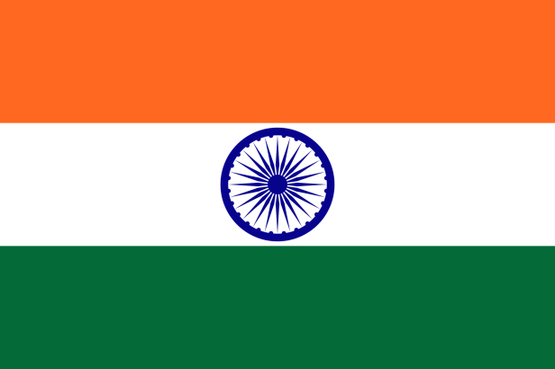
We started with a basic COIN layout, then added the details unique to Gandhi. We used a muted palette of greens and oranges, drawn from the modern flag of India, to delineate the various spaces. We used the star and crescent of the flag of Pakistan to show Muslim spaces, and historic flags from various Indian princely states to show their special spaces. We used each faction’s Available Forces Box to show a historic image central to that faction: a regal parade of elephants for the British Raj, Gandhi meeting with Nehru for the INC, Muhammad Ali Jinnah giving a speech for the Muslim League, and a troop inspection by Subhas Chandra Bose for the Revolutionaries. And we used historical photos in other areas, including each city, and the Jail, Overflow, and State of India Boxes.
Overall, we are very happy with the result.

The game comes with a single large mounted board measuring 22″ x 37″. When the board is laid out, it really appears much larger than that and frankly is a very attractive backdrop for the game. I am a big fan of green and the complementary colors of green, orange and gold chosen here really make a high contrast look when placed next to one another. The colors gold and orange are considered warm colors with their yellowish hue and give off some excitement and energy while green is a cool color, being a mix of blue and yellow. The dark brown used for the area boundaries as well as the darker colors of the cities really makes for a striking yet appealing sight.
Also, as was mentioned earlier by Bruce, these colors form the base for the modern Indian flag and I really think that this is one of the most important parts of the board design.
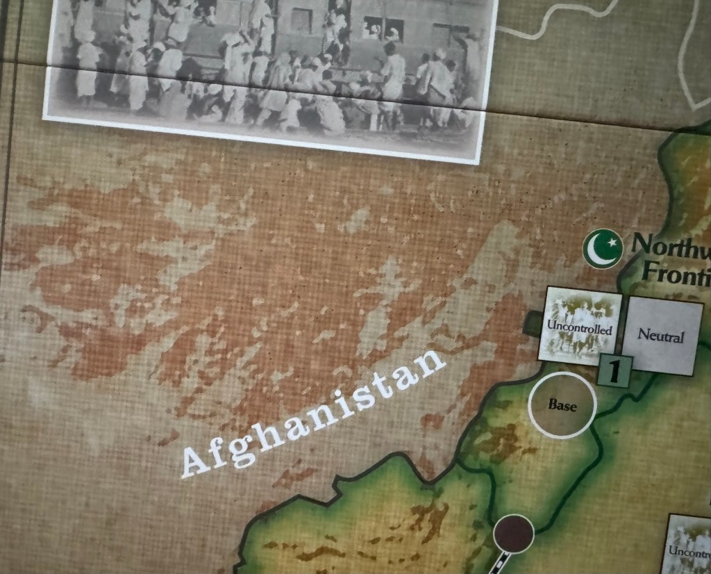
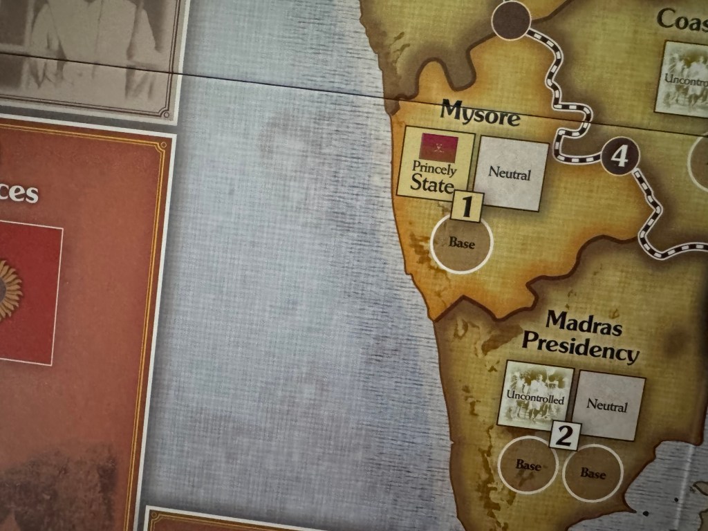
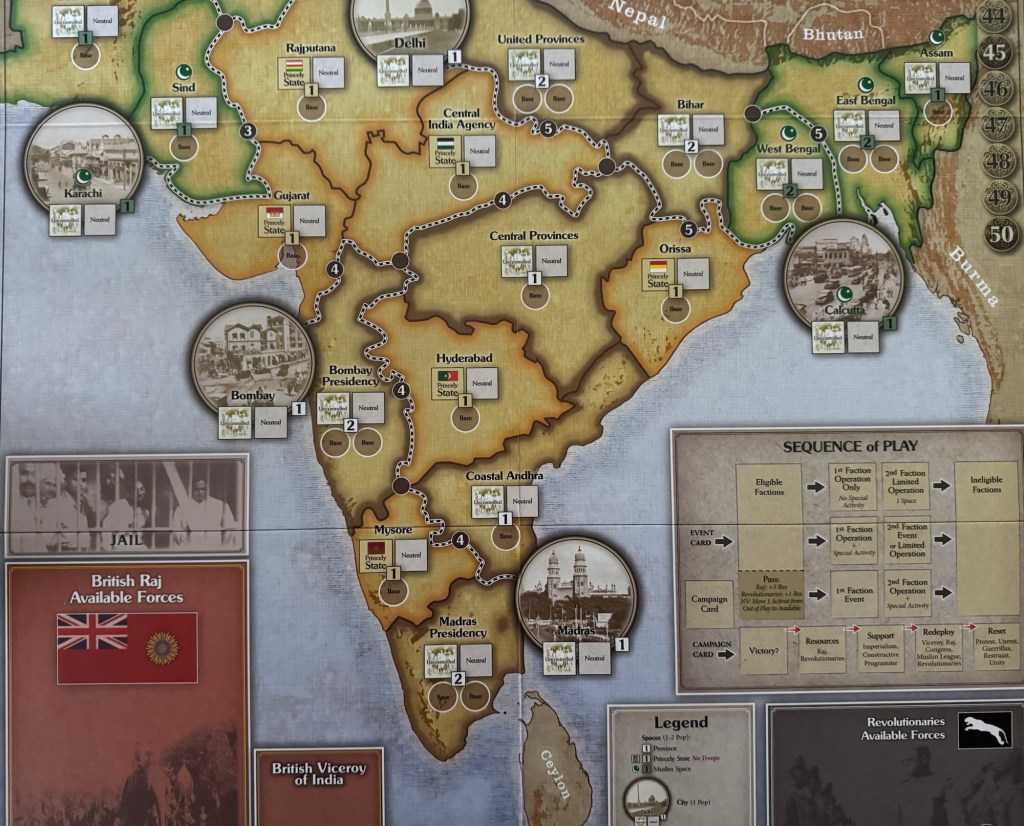
The board is focused on the Indian subcontinent and is broken up into 25 playable spaces, with 5 of those being the major population centers of Delhi, Karachi, Calcutta, Bombay and Madras. The border to the north is the imposing Himalayan Mountain Range as well as the countries of Afghanistan, the USSR, Tibet, Nepal and Bhutan. But I want to take us into a bit of the details that are shown here by Knut as he is a master of the use of both color and odd random shapes to create a very interesting looking mountain terrain. This terrain looks so strong and immovable that it really sets the northern boundary of the game board. Part of this is that the chosen color of sandy red really complements well the gold and green in the northern tier of the Indian subcontinent. Furthermore, the area located outside of the playable spaces in this area are washed over with a different more gray shade of red to create a definite difference in the mountains that are on the board versus those just off of the board.
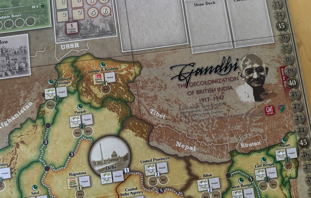
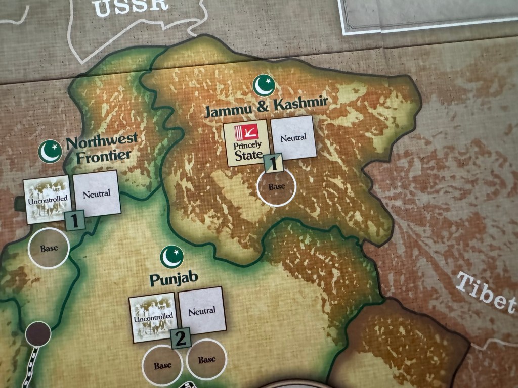
Here is a look at these peaks and their color shown closeup in the areas of the Northwest Frontier, Jammu & Kashmir and parts of Punjab. You will notice that there are no graphical representation of typical mountains on this board. But rather, the use of streaking and spotty color has created a feeling of permanence and stability in the otherwise flat and featureless landscape.
In the picture above, I very much enjoy the livened up color of the mountains. But keep in mind that the color used for the mountains hasn’t necessarily changed but only our perspective of the color as it is again a backdrop of gold that gives it some life and energy. These mountains are some of the best features on the board and I really very much appreciated Knut’s approach to drawing them and to the care he gave to highlight and accentuate them to tell a greater story of northern India.
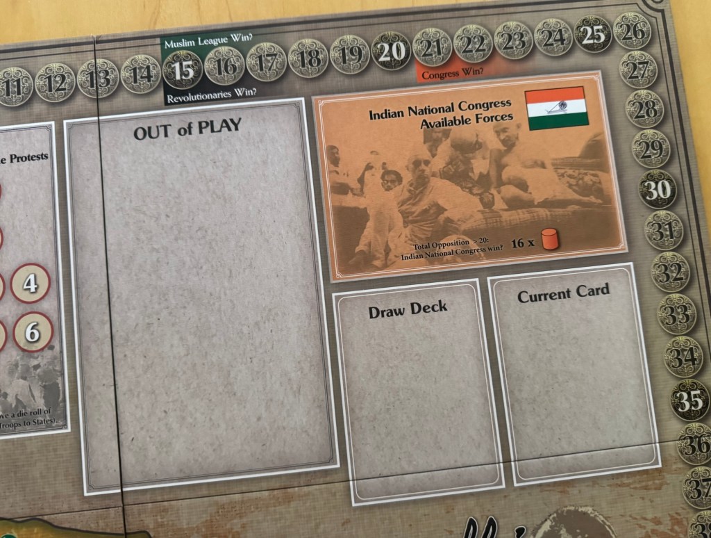
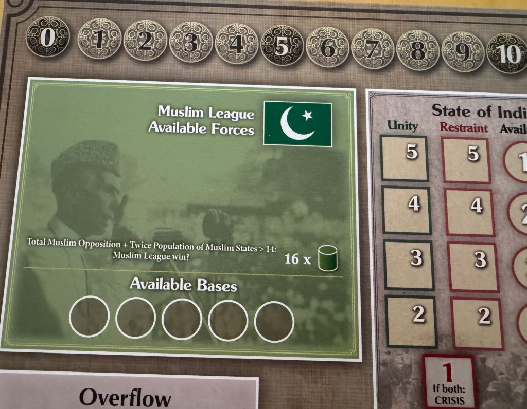
There are so many very nice elements found on this board and I now am going to take you through a few that caught my eye. In the next picture, we get a look at the general records track that goes around the edge of the board from number 0 in the top left hand corner to number 50 in the bottom right hand corner. On this track, the players keep track of several things including resources and their individual victory conditions with various markers. But, the thing that I would like to point out is the use of the stylized Indian Rupee as the circle for each of these spaces. This is not necessarily a depiction of the period coins of this time but an amalgamation of the type of coins used in British India. I love this image here and it really drives home the purposes of the track and how it is used in the game. This is a really simple but nice touch for the graphical design of the board.
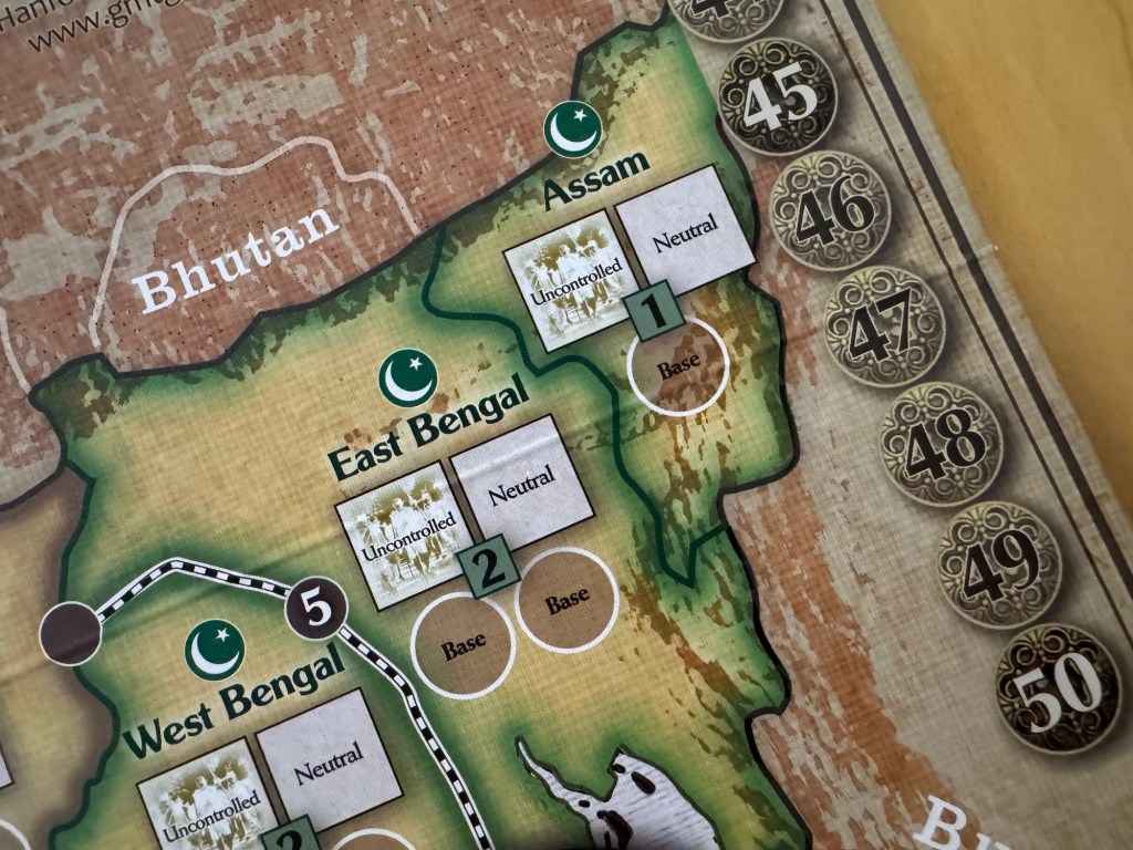
I wanted to also show you a closer view of some of the provinces and their look. First off, you will see that there is a black and white dotted line that connects some of the major cities and the various locations found on the board. These represent the railways that were common in India and by which many of its citizens would move about to conduct business and commerce. These railways were installed by the British and while are very useful to the Indians, they also serve as a constant reminder of the oppression put upon them by their occupiers. In the game, the insurgent factions can conduct sit-ins and strikes on these main lines of communication and transit and disrupt the operations of the British Raj.

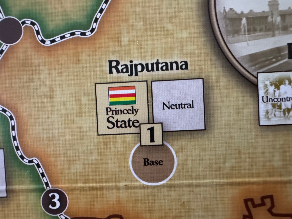
If you look closely at the board, you will notice this cross hatched pattern that is drawn as a part of the background of each of the areas. I really like this touch and like to think about it as a representation of the countryside in the relatively rural agrarian economy of a majority of India. These cross hatches represents fields or better yet, plots of land that have been divvied up by the British Raj and sold to the locals to use and hack out their living. This cross hatch pattern is found on a majority of the rural areas of the board but stands out the most when found in the golden colored areas such as Rajputana below.
One other really nice graphical touch is the use of horizontal intermittent black lines in the Indian Ocean to differentiate the water from the land. I really love this approach and feel that it really creates a very interesting visual differentiation when put up against the cross hatching on the land. It also gives the ocean the feel of movement and energy and keeps the eye moving around checking out the detail.
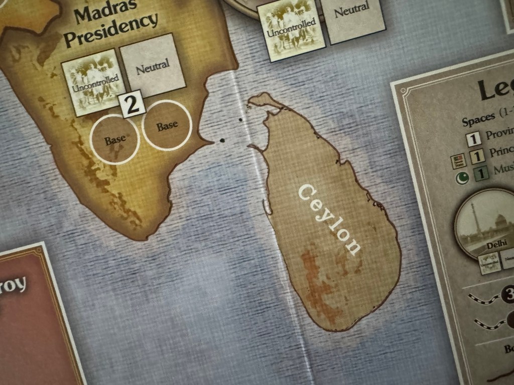
The horizontal lines are also only found in the water that is nearest to land which denotes the shallower nature of this water as compared to the deeper water farther from shore. I think that this type of detail, while easy to overlook, is really great on this board and shows the focus on reality by the artist in their efforts to portray the situation.
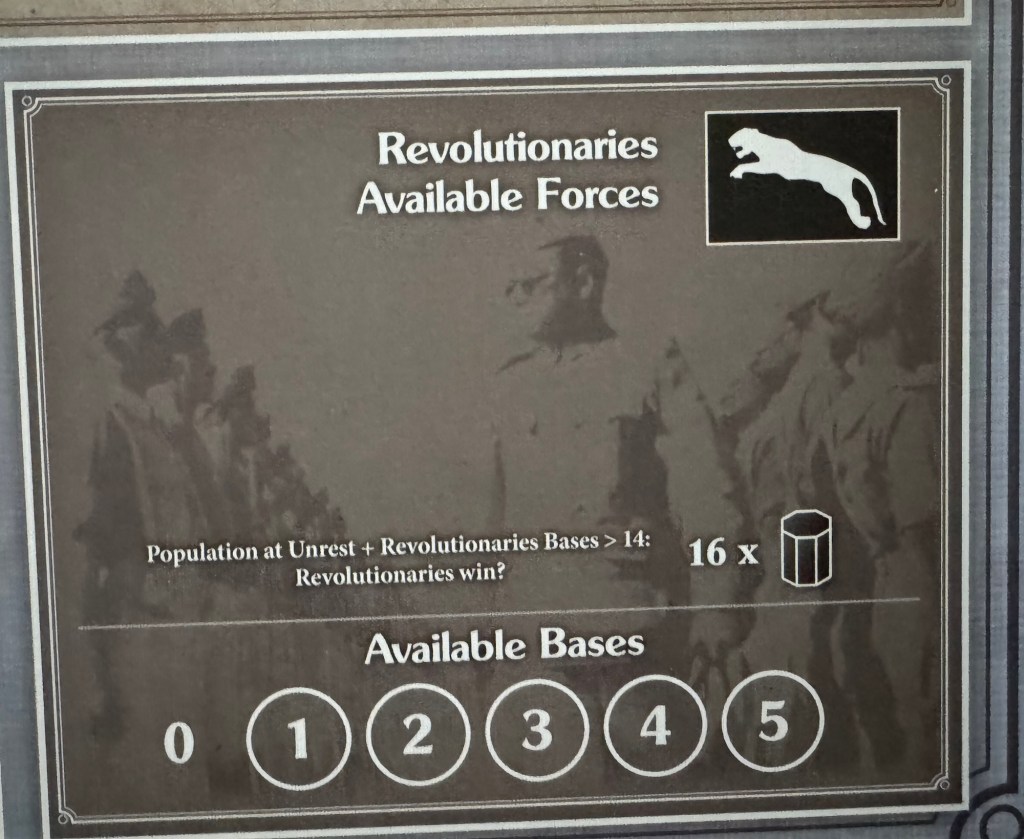
Aside from being beautiful, a good wargaming board must assist game play and provide the necessary game guides such as the Sequence of Play, map legend and other boxes and spaces used for the COIN Series. Knut also does this very well as the Available Forces, Sequence of Play and other game boxes, include historical pictures representing the different factions (see comment from Bruce above).
The INC has the flag of India and the orange color in the background with a look at Gandhi himself.
The Muslim League uses the green color for the crescent moon and also has a historical picture.
The Legend is clear and identifies the different parts and pieces of the symbology on the board that allow players to quickly and easily recognize these locations and better understand what they represent to their efforts.

The Revolutionaries Available Force Box is also well done with the color black. You might think that this is representative of the “bad guys” here but that is not the case as it borrows from their flag and colors.
The board for Gandhi is stunningly beautiful and gives players a very welcoming and visually interesting look at this struggle for independence in India. I just very much appreciate this game for what it is trying to do by telling this story and for also introducing new elements to the COIN Series including the addition of the new Non-Violent Factions.
Here is a look at our video review for Gandhi:
The next board that we will take a look at in the series is Battles of Napoleon: Volume I – Eylau 1807 illustrated by Marc von Martial.
Here are links to the previous entries in the series:
Kekionga!: A Dark and Bloody Battleground, 1790 from High Flying Dice Games
Campaigns of 1777 in Strategy & Tactics Magazine #316 from Decision Games
Battle Hymn Volume 1: Gettysburg and Pea Ridge from Compass Games
From Salerno to Rome: World War II – The Italian Campaign, 1943-1944 from Dissimula Edizioni
This War Without an Enemy: The English Civil War 1642-1646 from Nuts! Publishing
Holland ‘44: Operation Market-Garden, September 1944 from GMT Games
Maori Wars: The New Zealand Land Wars, 1845-1872 from Legion Wargames
Imperial Struggle: The Global Rivalry – Britain & France 1697-1789 from GMT Games
Stilicho: Last of the Romans from Hollandspiele
Nevsky: Teutons and Rus in Collision, 1240-1242 from GMT Games
A Most Fearful Sacrifice: The Three Days of Gettysburg from Flying Pig Games
Donnerschlag: Escape from Stalingrad from VUCA Simulations
Keep Up the Fire!: The Boxer Rebellion Deluxe Edition from Worthington Publishing
Liberty or Death: The American Insurrection from GMT Games
Lanzerath Ridge: Battle of the Bulge from Dan Verssen Games
Salerno ’43: The Allied Invasion of Italy, September 1943 from GMT Games
Bayonets & Tomahawks: The French and Indian War from GMT Games
Undaunted: Normandy from Osprey Games
Traces of War from VUCA Simulations
SCS Ardennes II from Multi-Man Publishing
Almoravid: Reconquista and Riposte in Spain, 1085-1086 from GMT Games
Walking a Bloody Path: The Battle of Fallen Timbers, August 20, 1794 from High Flying Dice Games
All Bridges Burning: Red Revolt and White Guard in Finland, 1917-1918 from GMT Games
Storm Over Jerusalem: The Roman Siege from Multi-Man Publishing
Iron, Blood, Snow & Mud from PHALANX
North Africa ’41: The Western Desert, March to December, 1941 from GMT Games
Battles of the American Revolution Volume II: Brandywine from GMT Games
Ardennes ’44: The Battle of the Bulge from GMT Games
-Grant

Well chosen, this is truly a beautiful game. All the graphic choices in the game game were aesthetically great.
LikeLiked by 1 person
Yes. I remember seeing the final board for the first time when I opened the game and was amazed at its beauty.
LikeLike