
Grant asked me a while back if I would like to write a guest post about my experiences in creating playtest components (and playtesting) for Mark Herman. As with all productive working relationships it starts with sharing a passion for the subject matter and always being polite and respectful when you engage and give feedback. Being constructive will always be better than being a negative nelly. It’s even better when you put your time and effort into showing what can be done. My first foray into graphics design was with Empire of the Sun about 4 years ago.
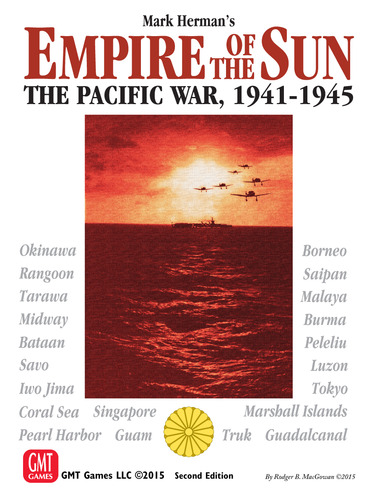
One of my favorite subjects to study and read about is the Pacific Theater of World War II between Japan and the United States. I have read a lot of the history and I am fascinated by the events and personalities involved. I have played numerous games on the subject at various scales, both on cardboard and the computer since the 90’s. While I don’t claim to have great expertise I like to think I know a lot about the Pacific War and what makes a good game on it. Of them all, Empire of the Sun hits that sweet spot for me in terms of how it deals with politics, combined air-land-naval operations, military intelligence, the overall scale and counter density (just one countersheet and a half!) creating a wonderful gaming narrative that can be played leisurely over email for three months or play a scenario in half an afternoon (assuming you don’t succumb to analysis paralysis) to grinding out a campaign over the weekend or multiple sessions.
When I like a game a lot I tend to tinker and the very first thing that struck me was the color scheme of the counters; it seemed straightforward and obvious that color could be used to help out players when the dreaded Inter-Service Rivalry hit and were prevented from activating army and navy units of their side at the same time. Instead of having just one color for Japan and one for the US units, I posted a suggestion in a BGG thread that the Army and Navy of both the US and Japan should have different color schemes. I modified a copy of the VASSAL module I was using and posted some examples to highlight how it would look like (incidentally this also marked my first foray into VASSAL module making). I ended up creating an updated color scheme version of the module and sharing it to the community where it was well received. Mark Herman then contacted me to ask if I could also make an updated Cyberboard version (yet another computer assisted boardgaming tool I learned to modify on the fly). It helped that right around this time I was starting to participate on the regular Empire of the Sun CSW Staff Games.
When the second edition was officially put on GMT’s production slate, Mark revisited the nearly decade old design, using what he learned in the interval after playing well over a hundred games to adjust the card deck, correct mistakes and use the opportunity to enhance the gaming experience. He applied his knowledge and graciously handled input from the regular gaming community (everyone is a budding game designer right?) as well as soliciting help from his core group that have played the game extensively over the years to reorganize the rules.
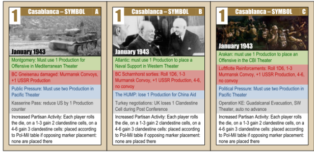
Since he wanted to add some more cards he posted on CSW the text of examples he intended to test to acquire some feedback. I quickly created a mockup of one of them (Battle for Java) that was exactly the same style as in the Empire of the Sun deck and shared it (If I may be so bold you would have been forgiven if you had thought Mark Simonitch himself had created it). Mark was so delighted that he asked for a high resolution image he could print and add to his deck for playtesting. Soon enough he asked if I could do some more cards. I was absolutely thrilled at the opportunity so I was happy to help. I ended up creating a subset of updated 2nd edition cards that Mark printed (maybe 48 cards total) and distributed to his playtest group so they could try them out in various Empire of the Sun games prepping for the 2nd edition print. I also lightly edited the map to expand the India track that Mark wanted to test in an effort to streamline that game mechanic (which was confusing and vexing in the first edition). I believe Mark printed out the segment he needed and placed it over his copy of the map to use.
When it came time to officially work on the 2nd edition, Mark Simonitch changed the color scheme improving on my original idea. One thing I learned from this graphic design process was: always take into account color blindness. While the color scheme was changed to give the US Army a typical “army green” style and the US Navy kept it’s “blue” style (not to mention giving the US marines the same scheme as the navy), I originally gave the Japanese army a sort of dark yellow-brown scheme in my updated VASSAL module. I didn’t realize that color could be confused with the US army green by folks with red-green color blindness. Simonitch made the IJN white with red fonts rather than change the IJA which avoided the problem and was aesthetically more pleasing to the eye to boot. There is a reason the man is a considered a graphics and game design giant in this industry.
Some time later Mark asked if I was interested in helping him out with the cards for an Empire of the Sun style magazine game he called Plan Orange. I was happy to chip in and just used the same card style as in the original to create them for him, hunting down appropriate period photographs to use. Since this would be an RBM Studio publication (C3i #29) Rodger MacGowan contacted me concerning the art. At this time my graphics design tools were still not industry standard but he graciously used my exported PDF documents as a template and basically just changed the card backs (which I guarantee, are superior to my original attempt). Otherwise, he replicated the card fronts exactly as I delivered them to him with the art I supplied. I have nothing but praise and respect for the talent that is Rodger MacGowan who has decades of box covers and other art gracing most of our gaming shelves. I hope to meet him in person one day and thank him for letting me work on his magazine (to which I have contributed articles as well!)

For my next project Mark asked me to tackle Churchill’s cards. Typically, Mark will have a game idea or concept that he will build into a bare bones prototype and test it out first to see if the result is an engaging experience (he usually has several of these set up at any given moment in time). As he likes to say, if he personally is not addicted to playing it, then how can he expect anyone else to play his designs? Once he’s gone beyond the skeleton stage he’ll start seeking groups to playtest. I’m sure Mark has plenty of experienced graphic designers he can ask for some nice prototyping so I deeply appreciate it when he turns to me since I’m basically still wet behind the ears. He always asks politely since he’s acutely aware that time is not plentiful when you’re the father of two toddlers (now pre-schoolers), but working with Mark is very stimulating and provides a great challenge not unlike playing his games so I always try to make time unless it’s absolutely impossible. I have learned quite a lot about time management in the last few years as I juggle children, wife, work, gaming, other hobbies and now graphics design.
Churchill was my first card design from scratch so this wasn’t a matter of replicating an existing one to just fit a new scenario like Plan Orange. As with all endeavors, the first thing to do is research. I like the fact that working with Mark has pushed me into exploring more about topics that either I know nothing about or perhaps have only dabbled with superficially. I like history in general even if I have made the Pacific War my most favored topic. I spent quite some time reading about the WWII Allied conferences and searching the public domain for photographs. Since the cards were all about important historical figures it seemed obvious to me to adopt a style that would use their portraits. I had to allow space for card text along with their primary value and name. For the card backs I used the portraits of each statesman.
Then I had to design the conference cards. For the common back I used a picture of all three great leaders with a gold border. Initially I had used the picture from the Yalta conference (1945), but Herman felt Roosevelt looked too sick in that picture so I switched to one from the Tehran conference (1943). For the fronts I used a picture that represented the historical random event for that conference (always involving the Axis) and added the boxes that impacted each Major power, the Axis event and the Political Military event. Initially I used a landscape layout but eventually it made better sense to make it portrait. At first, I had a nearly transparent watermark of a picture of a huge round conference table with all sorts of staff sitting around it. One thing I learned is that while watermarks can add nice flavor to a card if it is full of text then don’t bother because it will either interfere with the text or your watermark will be so dull it might as well not be there. Needless to say that version didn’t make the cut.

Once again, Mark Simonitch took my designs and basically just added a professional touch though he did redesign somewhat all the card backs. Another lesson I learned; while using an entire picture as a card back may look cool it’s functionally stifling because you need room for card titles, game company logos and so on. Simonitch kept the pictures but resized them appropriately or used color portraits as needed. He also took care of the map art, charts and other aids. Still, the end result you see in the front of the cards is basically my own.
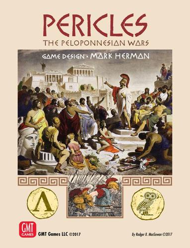
Pericles came next and for this one I ended up doing a fair bit more than just cards. While I don’t playtest much (time is short) I was actually able to spare some time to test a few systems in addition to design. I like to say that Pericles is Mark Herman’s euro-crowd trap. The game looks like a euro. It has cards, wooden bits, a victory point like system called honor, no die rolling. That sounds like a recipe for a euro and yet Pericles is a straight up political-military wargame (the cards themselves provide randomness in both politics and battle). Once again, I started reading up on the Peloponnesian wars and eventually downloaded a copy of Thucydides seminal work to brush up on Athens and Sparta. One of the benefits of working with Mark is how he expands your horizons.
For the cards, while I had an extensive list of personalities it’s not like you can put portraits of ancient Greek politicians or generals and call it a day. I decided not to bother since we don’t know the appearance of nearly all but the most famous of them (and then only through sculptures!) Because the cards had bonuses for the issues I went heavy for iconography and organized it such that you could partially fan out the cards and still have all the info you needed (unlike other games, in this one you tended to hold between 6 and 9 cards and you want to get a good overview of what you’re holding).
Generally speaking, the design functioned quite well and didn’t look too busy. I gave each card a nice number on the top left, a title and two boxes. Each box belonged to one of the factions. They had some text with a name and a blurb about the personage while the left hand side had the game information in the form of numbers and icons. Of course Mark had a couple of cards that broke the mold and took a lot of creativity to fit in all the necessary graphics! Initially the cards were all right side up but a playtester commented about the look of regular playing cards how the graphics for the face cards (Jack, Queen and King) had both face up and upside down portraits. He suggested the same for our faction cards. Mark communicated this to me and I was able to flip the bottom portion 180 degrees, repeat the title and number so it looked very much like regular playing card! The results were quite satisfying, I wished I had thought of it. But now, depending on the faction you flipped the card upside down to read the pertinent text. Quite a lesson in function, if GMT makes a No Retreat reprint I would heartily recommend this approach. The card backs used pictures of famous statues: Aristophanes, Pericles and a hoplite for the Spartans.

For this title I also produced the counters and came up with the style and iconography used by the game. Mark purposely designed the counter mix to fit a 130 sheet similar to Churchill since he envisioned using that format which comes with rounded corners. I made it fit! Keeping in mind fellow color blind players, I made sure to include initials for the various factions on the counter issues as a hedge against color (e.g. AK, EK, AF, DF). While I wasn’t able to produce a physical prototype of the game I did use a different tool (Zun Tzu) to produce a digital playtest copy which I used to play the various smaller card scenarios and battle vignettes as well as the theater scenarios. My involvement extended to the creation of the charts for the bots and the player aids. Since I did most of my playing solitaire I was able to provide a few snippets of feedback to Mark in this area, primarily some suggestions on how to phrase and write some aspects of the solitaire charts as well as report results on the training scenarios.
Once the development process was complete, my simple designs were given the professional touch by a pair of excellent and talented artists: Knut Grunitz (map, counter and card art) and Charlie Kibler (rules and charts). I also want to give a shout out to David Dockter of the famous 1st Minnesota Historical Wargaming Society, since he transformed Mark’s powerpoint playtest map into the fabulous picture you see on the board; the final product is mostly unchanged from David’s prototype. Once again, Mark Simonitch liked the overall basic design work and pretty much kept it (with some good polish from Knut, that man just knows how to improve icons), employing the artists to give it the GMT gold standard art treatment.
For this work I learned a lot about the use of textures as part of card and chart background, period font and use of negative space. I initially used an underline for values to establish certain conditions like controlling faction on a card; I was running out of space and ideas to put all the information succinctly on the card. After seeing Knut employ dark backgrounds and white icons, I figured negative space would also be much more clear than an underline. It worked great! Meanwhile, Charlie creatively employed some shadow work for the display of the various wooden bits in the player aids. It’s a minor detail but it goes a long way. Mark Herman provided the content, while I set the basic layout for the materials and Charlie whipped it into a work of art. I can’t praise the man enough. You’d better believe I was holding my copy of Pericles like a precious cultural artifact when it arrived.
Incidentally, the game box lists me as the game developer. That’s just Mark being generous and appreciative of my help. At this stage of his profession he’s designed and developed games for more than 30 years. Mark doesn’t need a developer to look over his shoulder. I probably did maybe 5% for helping to proofread the rules and suggest a few minor rules and chart changes, but I must admit I should have devoted more time to the playbook; some important stuff came up post production and Herman can only do so much by himself without additional sets of eyes. I failed to back up Mark in the critical area of the extended example. I focused heavily on making sure the charts and play aids had no mistakes (or as few as possible). Hopefully I’ll get a chance to correct the mistakes in the next reprint.
I would like to briefly interrupt the tales of Herman related work because it was at this point that I reacquainted myself with some old Ares Magazine products: notably Albion, that excellent hex and counter fantasy wargame. It’s a classic of elf and gnome armies vs ogre and troll armies with heroes and magic, all on a map of Britain. It’s an excellent design though if played competently the Faerie forces should usually win more often than not. I should mention that Karoly Szigetvari created a sequel game of sorts called Fornaldar as a homage to the original Albion preserving the aesthetics of the SPI original while giving his design a more colorful palette and some creative color schemes. I was so taken with his work and wanted to produce my own counter sheets that I went ahead and started a project to “remaster” the original Albion SPI artwork to resemble that of Karoly’s Fornaldar. It took me about a month of work and was well received by many fans. Karoly was enthusiastic and supportive, going so far as to supply me some of his original graphics used in Fornaldar so that my game markers would match his. This allows fans of both games to have nearly matching counter style sets. In this endeavor I was aided by artist David’s Cooper’s website and his library of SPI icons and fonts. I was able to use them to create a high resolution PDF. Since I wasn’t limited by SPI’s old 200 piece countersheet, I used a 240 piece countersheet and produced many more breakdown army counters plus included an old variant by Gary Robinson. This ended up being a deluxe treatment so to speak and I got some nice die cut counters courtesy of Kerry Anderson (you can look him up on the web as the SPI Wrecking Yard).

My next work with Mark was not design related but playtest related. He created a scenario for Empire of the Sun he called South Pacific and wanted my help with it (since it would be published as a gateway magazine game in C3i). I focused primarily on playtesting as I managed to find time to play several games. While I wasn’t able to write detailed reports I did give Mark my impressions since Japanese air power seemed quite powerful and Allied air replacements didn’t seem able to catch up. Having read Fire in the Sky: The Air War in the South Pacific by Eric M. Bergerud I recommended Mark tone down Japanese air a bit and boost the Allies since the scenario wasn’t capturing the feel of a relentless allied air campaign grinding down the Japanese air forces. If you have played South Pacific and have felt from time to time the Japanese air seems quite strong, remember; they used to be even stronger! I’m not the only one who playtested the game. I was just one more tester part of a larger group.
Recently Grant had a chance to interview Mark over his latest game; a historical 20 minute game “filler” with some deep strategy known as Fort Sumter. It started out somewhat based on the game 13 Days: The Cuban Missile Crisis, but slowly morphed into its own streamlined creation so the end product is actually quite different from that wonderful title. The premise is that you’re taking on the role of either the Unionists or Secessionists and trying to win the Secession Crisis of 1860-61 triggered by the election of Abraham Lincoln. In this case it’s the crisis that snowballed into the U.S. Civil War in 1861. I created the playtest map based on the historical Colton Map of 1860 and more or less created the grids and boxes per Mark Herman’s overall layout. I also created the playtest cards for this particular work. Early on I learned that I wasn’t making enough of an effort to distinguish the two card decks (Objective cards and Strategy cards) so I went with a darker card back for the objective cards. Overall I tried to keep the card design similar enough to For the People (Mark Herman’s great CDG on the U.S. Civil War). In an effort to address color blindness, the Unionist cards have a light blue circle with a black number, the Secessionist have a gray circle with a white number and I decided to experiment with the dual use events giving them a completely white background with a red number. Still, considering all dual-use cards are value 3 cards, that may not have been as important as I thought.
Where I dropped the ball was on the map, the colors are not ideal and for certain color-blindness afflictions the reds and blues blend too much together. In an effort to address this the various spaces on the map have their own symbol to define their type so it’s not dependent on being color coded. Overall both Mark Herman and Mark Simonitch praised my work on the playtest map but I believe GMT eventually decided to rework the map and emphasize functionality more. I defer to them since they’ve been in the business for years so they know what works and what doesn’t. I’ve seen some examples of the newest map and it’s definitely cleaner, less cluttered and the colors sharper. A lesson learned here is try to not get too enamored of a specific color palette or period art. If it works great, but if functionality suffers, you need to tone it down or drop it altogether. Also, while I tried to strictly limit myself to public domain art I’m not sure if GMT is allowed to use the Colton Map in a boardgame production. This is of course just speculation on my part.

Currently I’m grinding away at the next generation vassal module for Empire of the Sun (to make it more like the Plan Orange module), I need to work on the counters at this point but the cards are finished and the new hand windows emulate the Churchill module. Meanwhile I keep trying to have an ongoing art project to build up more skills. I’m considering doing another SPI “remaster” counter sheet project. Perhaps Freedom in the Galaxy which is one of my all time favorites, though now that Fantasy Flight Games has published “Rebellion” we can now play the real deal so I feel less motivated.
As for the future, I have always tinkered with game design ideas and art. I wish I had preserved this but, back in the late 90’s I was considering an operational space combat game and created about two dozen blueprints for the spacecraft, outlining engines and turrets and other fun stuff. If you ever played Wing Commander 1 or 2 on a PC you know those game boxes came with nice paper blueprints of the fighters, I was trying to emulate that. Aside from a very small print & play space game, I don’t have any official designs but at some point I want to take a crack at doing a kind of “Empire of the Sun” lite game with a map more similar in scale to the one in Fire in the Sky. I also think there is room for a kind of Pericles style 4 player wargame of the Pacific with Japan and the US fighting and their respective Army and Navy factions bickering over objectives and resources. Really put Inter-Service Rivalry in the forefront of the design. I also have notes for a kind of States of Siege game (pioneered by Victory Point Games) that is conceptually similar to Freedom in the Galaxy: Empire vs Rebels, with the ability to play either side against a deck or possibly two player. Don’t hold your breath for these though, as a father of two small children I suspect I’m years away from having the kind of free time to fully flesh out these concepts into workable prototypes.
That brings things to a close. Who knows what the long term future holds? I do hope to keep contributing to the community with art or modules as the case may be (and maybe game design) and I’ll work with Mark Herman as long as he has projects he wants to involve me in. I have never regretted a single moment and will always appreciate the friendship we have established and hope to visit New York one day and play a game or two. I’m pretty sure he’ll crush me and that’s perfectly fine. It’s the play and camaraderie that’s important. We indulge in this hobby to have fun, to be creative and learn a little about history and ourselves along the way. It’s the icing on the cake of life.
-Francisco
[Editor’s Note: I want to personally thank Francisco for his contribution of this article to our site, as I found it to be a very interesting read. He has been a regular reader and commenter on our blog since the very beginning and in my very first post (Empire of the Sun – After Action Report) I still remember one of his comments to me chiding me for my usage of X Corps in an assault on Kwajalein in Empire of the Sun.

I remember telling Alexander after this comment that we were doomed as we were relative novices compared to some of these grognards out there that would be reading our stuff. It made me take more care in how we played games and how we reported on those games. Now, nearly 2 years later, we still have faithful readers like Francisco and I am grateful for that. -Grant]

Francisco continues to demonstrate his talent and his modesty. Quite frankly I do not know I ever got along in life without him. He is awesome and the future of our hobby.
Mark
LikeLiked by 3 people
Having played games regularly with Francisco the past few years, I can attest that he is very passionate and knowledgeable in historic scenario games and wargames. Without his guidance and influence, I would probably not have ventured as far into this side of the gaming hobby.
LikeLiked by 2 people